If you’re experiencing a situation where your Shopify store is receiving a lot of traffic, but, you’re not seeing an increase in sales, you’re not alone. In fact, this is a common issue that many store owners face.
However, it’s important to understand that traffic alone doesn’t ensure sales. A number of things could be contributing to your lack of sales. So, let’s dive in and find out the most common reasons why you getting a lot of traffic but no sales, and how you can fix it.
Landing Page Optimization Mistakes
A bad landing page is one of the top explanations for why your store may have a lot of traffic but no sales. It’s critical that your landing page makes a good first impression in order to attract visitors to take action.
Because the landing page is the first thing a visitor sees after clicking on an ad or a link, it must make the best possible impression.
The most common landing page mistakes that can lead to high traffic, but no sales are:
1. lack of clear call-tp-action,
2. poor design,
3. not enough information,
4. too much information,
5. slow loading time
6. lack of social proof, and
7. poor targeting
Lack of clear call-to-action
The clear call-to-action tells visitors what to do next after they land on your landing page. Without a clear CTA, visitors can’t know what to do next or they can be hesitant to take action.
A clear CTA can be: “Buy now” or “Sing up” and it depends on what you want the visitor to do on your page.
The text used in your CTA plays a significant role in its effectiveness.
In this example, the recommended text for the CTA is “Shop Now,” which directly communicates the action visitors are encouraged to take.
However, we did an a/b test regarding what should be on your CTA.
The A/B testing compares different versions of a CTA to determine which one performs best in terms of conversion rate (CR).
In this case, the A/B testing results showed that the “Shop Now” CTA achieved the highest conversion rate of 1.5%, compared to alternative texts like “Learn More,” “Order Now,” and “Try Now.”

Based on the A/B test results, our recommendation is to use the “Shop Now” button to increase sales.
This conclusion is drawn from the statistically significant higher conversion rate observed with this specific CTA text.
Laning page design and performance
Even if your landing page is attracting high traffic, poor website design can be a significant factor preventing sales.
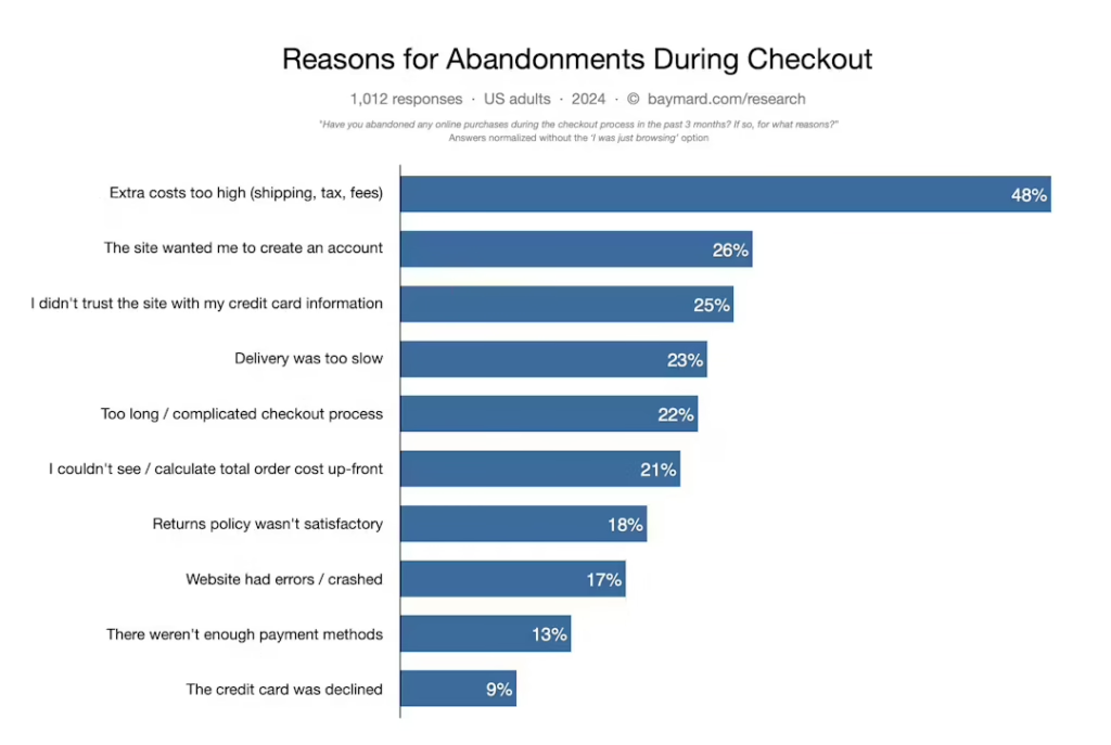
Research from Baymard Institute reveals that 69.8% of online shoppers abandon their carts, often due to complex and confusing checkout processes. This issue can be exacerbated by design flaws on the landing page itself, such as cluttered layouts or difficult navigation, which contribute to a frustrating user experience.
Additionally, Google’s data shows that 53% of mobile site visits are abandoned if a page takes longer than 3 seconds to load, highlighting how slow performance can deter potential buyers.
Moreover, Adobe reports that 38% of users will disengage with a site if the design is unattractive, and Baymard Institute found that 17% of users abandon their carts due to a lack of trust, often rooted in poor visual design and missing security indicators.
These design shortcomings can erode user confidence and prevent conversion, underscoring the importance of optimizing your landing page not just for traffic, but for a seamless, engaging, and trustworthy user experience.
Not enough information or too much
Despite high traffic on your landing page, having either too little or too much information can negatively impact your sales.
If your product pages lack detailed descriptions, you might be losing potential buyers. Econsultancy found that providing comprehensive product details can boost conversion rates by up to 20%.
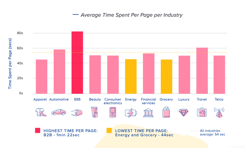
On the other hand, too much information can overwhelm users. HubSpot found that 55% of people spend less than 15 seconds on a webpage. If your landing page is cluttered or packed with excessive details, users may quickly lose interest.
Also, Baymard Institute reports that 40% of users abandon a site if the content is too confusing or hard to read. Striking the right balance between providing enough information and keeping things clear and concise is key to improving conversions and keeping users engaged.
Poor targeting
Poor targeting can result in high traffic but low conversion rates because it attracts visitors who are less likely to be interested in your product or service.
Even if your ads drive a lot of people to your landing page, if those visitors aren’t well-targeted, they are less likely to convert into customers. An optimization focusing on landing page views might lead to a click-through rate increase but result in an audience with a significantly lower intent to purchase—sometimes as much as 12 times lower in conversion rate compared to a well-targeted campaign.
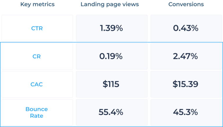
Optimizing for landing page views resulted in a conversion rate of just 0.19%, whereas optimizing for conversions resulted in a much higher conversion rate of 2.47%.
This stark difference underscores the importance of focusing on ad targeting and optimization that prioritizes conversions rather than merely increasing traffic. While high traffic numbers can seem beneficial, without targeting the right audience, it leads to inefficient marketing spend and low return on investment.
Navigation Mistakes
One often overlooked factor that can have a significant impact on sales is the navigation of your store. Bad navigation optimization can make it challenging for visitors to find the products they’re looking for. Visitors who are unable to find what they are seeking become frustrated and are more likely to leave the website without completing a purchase.
In the next part, we’ll talk about what can be wrong with navigation optimization.
Navigation mistakes that can hurt your sales are:
- difficulty in finding products,
- confusing menus,
- inconsistent layout, and
- lack of functionality.
Difficulty in finding products
Studies show that 40% of users abandon a website if the navigation is too complex or unintuitive.
This is particularly problematic for e-commerce sites, where easy access to product categories and search filters is essential for a smooth shopping experience. Users who use the site’s search functionality are up to 2.5 times more likely to make a purchase compared to those who do not. Therefore, if a website’s navigation fails to facilitate quick and easy product discovery, it not only diminishes the user experience but also directly impacts the site’s conversion rates and overall revenue.
Confusing menus
Confusing menus can significantly hinder user experience and lead to lower sales on e-commerce websites.
A well-organized navigation system is crucial for helping users find products quickly and easily. According to the Nielsen Norman Group, users often abandon websites with poorly structured menus or unclear categories, as they struggle to navigate and locate desired items.
This user frustration can lead to increased bounce rates and reduced conversions, as potential customers leave the site without making a purchase.
Inconsistent layout
Inconsistent layout across a website can significantly disrupt the user experience, leading to confusion and frustration.
Customers rely on familiar patterns and consistent design elements to navigate a site efficiently. When the layout changes unpredictably between pages—such as differences in menu placement, button styles, or overall structure—customers can become disoriented and may struggle to find what they are looking for.
This inconsistency can result in higher bounce rates and lower conversion rates, as users abandon the site due to the confusing experience.
Lack of search functionality
And lastly lack of search functionality. Lack of search functionality on a website can greatly impede user experience and negatively impact sales.
Many customers prefer using the search bar to quickly find specific products or information, especially on e-commerce sites. When a site lacks a search feature, it forces users to manually navigate through menus and categories, which can be time-consuming and frustrating.
This inconvenience can lead to increased bounce rates and lower conversion rates, as users are more likely to leave the site if they cannot easily find what they are looking for.
Best Practices for Optimizing Product Page
When we talk about online stores, it’s not enough to simply have a website and a product to sell. To attract customers, your store needs to be optimized in every way possible. And this leads us to product pages. If your product pages are not optimized, visitors can struggle to understand your products, leading you to low sales and missed opportunities.
If your product page is not optimized in the right way, you’re facing the following issues:
- poor product presentation,
- lack of information, and
- infective product description.
Product presentation
Effective product presentation is key to converting visitors into customers.
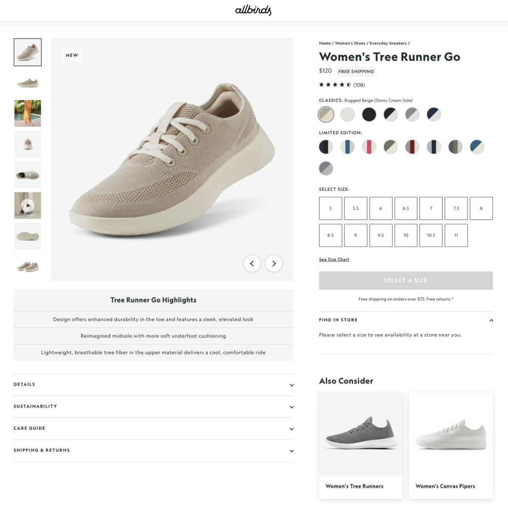
A well-designed product page should feature high-quality images and detailed descriptions to clearly communicate the product’s benefits.
93% of customers rely on comprehensive product descriptions and images to make purchase decisions. By providing clear visuals and thorough descriptions, you help customers feel confident about their purchase, reducing uncertainty and boosting conversion rates.
In addition to visuals and descriptions, incorporating trust signals and strategic keywords can enhance the effectiveness of your product page.
Also, including elements like “Free Shipping,” “Money-Back Guarantee,” and compelling CTAs such as “Buy Now” can significantly improve customer confidence and reduce cart abandonment. Using urgency and scarcity phrases, like “Limited Time Offer,” also creates a sense of urgency, encouraging quicker decisions and increasing sales.
Infective product descriptions
Effective product descriptions refer to the practice of crafting compelling, informative, and persuasive text that helps customers understand and be persuaded to purchase a product.
One more problem with product page optimization is the descriptions of your products. If your product descriptions are not optimized, they do not effectively communicate the benefits of your products. If your copy tries to speak to everyone, it may end u speaking to no one, which leads to visitors not fully understanding the value of your products.
And at the end of the product page optimization we need to mention customer reviews and a call-to-action. Well, like in landing page optimization customer reviews give the visitors the confidence to make a purchase. Also, with a clear call-to-action your visitors are encouraged to make the next step which is the purchase.
Checkout Page Optimization
A poorly optimized checkout page can lead to lost sales in several ways, impacting the customer experience and ultimately causing potential buyers to abandon their purchases. Here’s how:
- high cart abandonment rates,
- frustrating customer experience,
- unexpected cost, and
- lack of payment options.
High cart abandonment rates
A checkout page that is confusing or cumbersome can significantly increase cart abandonment rates.
Nearly 70% of online shoppers abandon their carts before completing a purchase, with a significant portion of these abandonments attributed to issues during the checkout process. Common problems include lengthy or complex forms, unexpected costs, and lack of guest checkout options.
Frustrating customer experience
If the checkout process is not intuitive, customers may experience frustration. Issues like confusing navigation, poorly designed buttons, or a lack of clear instructions can lead to a negative user experience.
A smooth and simple checkout process is critical for maintaining user satisfaction and reducing abandonment. Customers who encounter difficulties are more likely to leave the site and look for alternatives.
Unexpected costs
Surprise costs such as high shipping fees or additional charges that appear late in the checkout process can lead to frustration and distrust.
Shopify reports that 56% of users abandon their carts due to unexpected costs, emphasizing the importance of transparency throughout the checkout process.
Lack of payment options
A limited selection of payment options can also be a barrier. Customers may abandon their carts if their preferred payment method is not available. Offering a variety of payment options is essential to accommodate different preferences and increase the likelihood of completing a purchase.
Marketing Mistakes
Marketing mistakes that lead to high traffic but low sales can significantly impact your budget and Return on Ad Spend (ROAS). Here’s a breakdown of common mistakes, how they affect sales and their implications for your budget and ROAS.
Ad optimization
Mistake: Optimizing ad campaigns for traffic instead of sales.
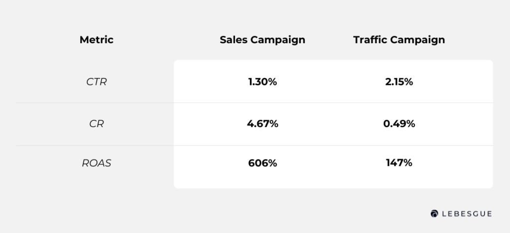
Impact on Sales: Optimizing for traffic results in more website visitors but does not necessarily translate into purchases. In a recent test comparing sales and traffic campaigns, the sales campaign, designed to drive actual purchases, outperformed the traffic campaign significantly. The sales campaign achieved a click-through rate (CTR) of 1.30% and had a conversion rate (CR) that was 89.5% higher than the traffic campaign.
Budget and ROAS Impact: While the traffic campaign had a higher CTR of 2.15%, it failed to convert these clicks into sales. This inefficiency leads to wasted ad spend on visitors who do not purchase, lowering the return on ad spend (ROAS). In contrast, the sales campaign not only increased ROAS by 76% but also ensured that the budget was spent more effectively on users with a higher intent to buy. Therefore, focusing on sales optimization, despite a potentially lower CTR, provides better investment returns and drives more meaningful conversions.
Impact of not using negative keywords
Mistake: Failing to use negative keywords in your Google Ads campaigns.
Impact on Sales: Without negative keywords, your ads may show up for irrelevant searches, attracting clicks from users who are not interested in your products or services. This leads to wasted clicks and no valuable conversions or leads. Additionally, irrelevant clicks can increase your cost-per-click (CPC) as your ad competes in auctions for less relevant queries, diminishing the likelihood of conversions.
Budget and ROAS Impact: Not using negative keywords results in inefficient spending and higher costs, as your budget is depleted by clicks that do not convert. This reduces the efficiency of your ad spend and negatively impacts ROAS. Incorporating negative keywords helps optimize your campaigns by filtering out irrelevant traffic, ensuring that your budget is spent more effectively, and improving overall campaign performance.
Ineffective ad copy and creative
Mistake: Use ad copy and creative that does not resonate with your target audience or accurately represent the product.
Impact on Sales: Poor ad copy can lead to lower click-through rates and conversions. Our analysis of 4,000 ads revealed that for prospecting campaigns, using emojis, promotions, and free shipping improves ROAS, while urgency and social proof can be counterproductive
Budget and ROAS Impact: Ineffective ad copy wastes budget on non-converting clicks, lowering ROAS. Tailoring your ad content to different audience segments—engaging elements for new prospects and urgency for retargeting—can significantly boost performance and ROAS.
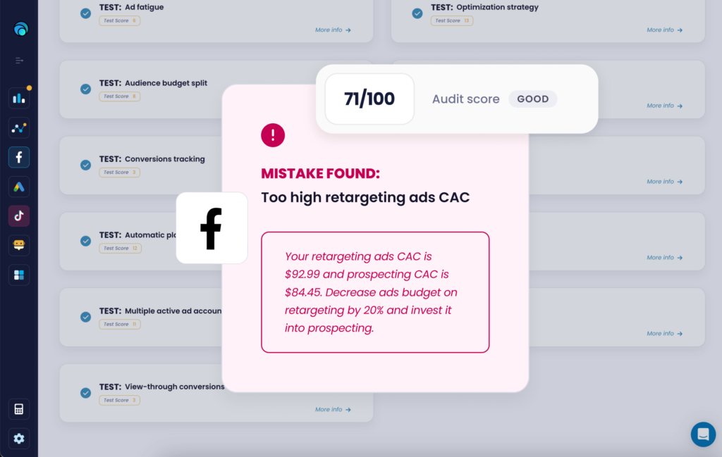
Not using Lebesgue AI CMO
Mistake: Failing to use Lebesgue’s AI CMO for optimizing your marketing campaigns.
Impact on Sales: Not utilizing Lebesgue’s AI CMO means missing out on advanced data-driven insights that could significantly enhance your campaign performance. Without this tool, you may not effectively optimize ad copy, targeting, and budget allocation. This can lead to lower engagement and conversion rates as your campaigns may not be as finely tuned to attract and convert high-intent users.
Budget and ROAS Impact: Ignoring the AI CMO results in inefficient ad spend and potentially higher costs, as you might allocate your budget less effectively. This inefficiency can reduce your return on ad spend (ROAS) and overall marketing effectiveness. Leveraging Lebesgue’s AI CMO helps optimize your campaigns with precision, ensuring better budget utilization and improved ROAS through actionable insights and targeted adjustments.
Technical Issues
Technical issues are the last thing to cover because they can have a huge impact on your sales. The most common technical issue is broken links. When customers click on a link that leads to an error page or a page that doesn’t exist, you risk losing sales. So, it’s important to regularly check your online store for broken links and fix them as soon as you can.
Another technical issue that you need to focus on is security. You want your customers feel secure when making purchases online.
So, if they see warning messages or other indicators that suggest your site is not secure, they may leave without completing a purchase. Ensuring that your store has the necessary security measures in place (such as SSL certificates), helps you to build trust with your customers and increase sales.
In addition, not having a mobile-friendly store can also hurt your sales. Nowadays customers browse and shop on their mobile devices, and if your store is not optimized for mobile, it can be difficult to navigate and make purchases.
Summing Up
In conclusion, several factors can cause low sales on your online store. But, you can enhance the user experience and increase the chances of customers completing purchases by identifying and addressing these issues.
Neglecting these problems can significantly impact your business’s success. Therefore, taking the necessary steps to optimize your website and improve the overall shopping experience is crucial. Don’t ignore these issues – take action to boost your sales and enhance your online presence.

