Do you always understand what impacts a purchase decision? Is it a price or convenient website design, ensuring a smooth purchase journey from one page to another? Take product pages as an example. If you’re an online merchant, you may overlook their optimization and leave all the work for promotions and deals. But what makes a product page truly successful? In this article, we’ll give you five tips on designing product pages that convert visitors into buyers and increase sales on your eCommerce website.
From browsing to buying: 5 tips for converting shoppers with product pages
Compelling product page design can eliminate shoppers’ doubts, establish your brand, and convince people to purchase. However, sometimes issues with your e-commerce store can prevent customers from buying. That’s where eCommerce website redesign comes in. By addressing any problems with your site’s design or functionality, you can create a seamless shopping experience that encourages customers to buy.
What should you start when designing a new product page or optimizing an existing one? Let’s look at five suggestions for crafting product pages that are effective and engaging. We’ll also share some examples from well-known brands to inspire you. So, buckle up and get ready to learn how to make your customers say, “I want to buy from this store!”
Write a clear product description
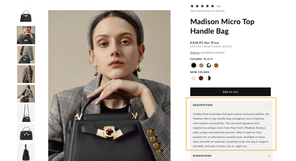
When you start designing product pages you need to write a clear product description. Words are a persuasion tool. The more your prospects can get from the product page, the better. And since you are selling online, a good product description also affects search engine optimization and drives organic traffic.
For example, a concise product description on the RVCA website provides all the needed information and doesn’t overload the reader with excessive details. It states the main advantages and purpose of the T-shirt:
- “keep you cool”;
- “supreme breathability”;
- “wear beyond the gym”.
Therefore, the buyers know they can wear it in different weather conditions and circumstances. There is also a bulleted list of the product’s primary characteristics. After reading the information, a visitor can see the delivery and return terms.
Include high-quality product images and videos
Speaking of other ways to enhance your product descriptions, pay the needed attention to the quality of your images. Let’s face it. It’s better to see something once than to read a lot about it. It especially regards the sphere of eCommerce. Therefore, having your description text and product gallery complement each other is a good strategy.
Significantly, don’t forget to optimize your photos. Pictures of the highest quality are crucial for the page. Yet large and weighty ones, by all means, shouldn’t be slowing down the page load time. You can do many things to bypass this from a technical perspective. Compressing images is one way to do it, and using caching tools is another, to name a few. The site visitors can then clear their browser cache to avoid clutter.
As for videos, according to Google, 50% of people watch them before purchasing. How can you create as many videos as possible in the short term? Offer your customers bonuses or discounts for sharing how they unpack or use products. Ask them to record and post a video on social media or your website.
Make your call to action prominent
A call to action is another crucial element on the product page. It should encourage people to add a product to the cart or proceed to checkout, bypassing the preview stage.
After all, potential customers need to know where they should click, and a CTA is a button or link designed for this purpose. It should demonstrate how people can interact with your website and what will happen after the click. Here are a few tips to make your call to action stand out:
- Use contrasting colors: Make your CTA button pop out with the help of color. It can be green, red, yellow, black, or whatever you like to differ from the rest of the page. It will draw the visitor’s attention, especially if you make the most important button the most obvious on the page.
- Use clear and concise language: Make sure your call to action is easy to understand and straightforward. Use action-oriented language and avoid vague or confusing phrases. For example, the CTA “Click here” tells nothing about the next step. Instead, you may write “Add to Cart” to be more specific.
- Place it strategically: Position your CTA in a prominent location on the page where it’s easy to see. Generally, placing it above the fold is a good idea so visitors don’t have to scroll to find it.
- Use a sense of urgency: Words like “limited time offer” or “only a few left in stock” can create a sense of FOMO (fear of missing out) and encourage visitors to act quickly.
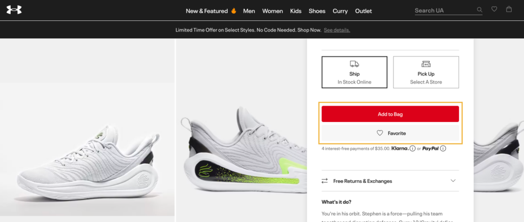
Look at the screenshot below from the Under Armour store. The CTA is easy to spot, thanks to its color and placement. And you know that you will see this product in your bag after clicking it.
Offer related products
Another crucial factor of a positive user experience is personalization. The ability to receive relevant product recommendations can encourage people to increase their average check or add more products to their wish list. Personalization also helps prospects discover more goods and services they might have overlooked. E-commerce personalization can take various forms, such as:
- customizing the website experience for individual shoppers;
- providing tailored recommendations;
- showing the most interesting content;
- sending targeted emails.
Thanks to data and technology based on a buyer’s browsing and purchase history, e-commerce personalization is possible. It aims to drive customer engagement, increase sales, and build customer loyalty.
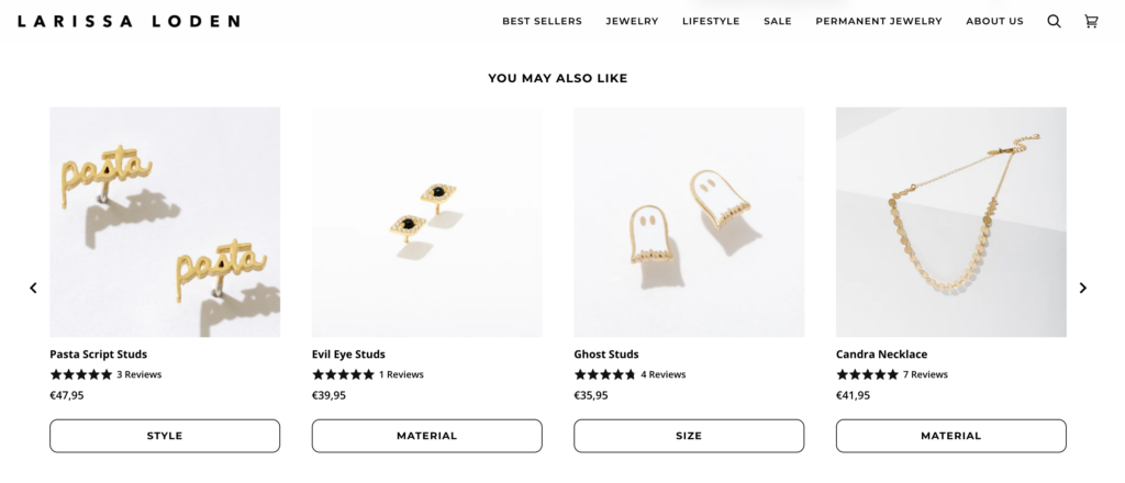
Display a section called “You May Also Like” or similar. It should contain comparable products to the one the consumer sees or adds to the cart, which you can observe in the screenshot from the Fabletics website below.
Use customer reviews and ratings
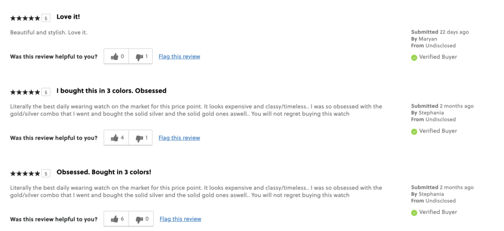
Showing customers reviews who have bought the product is a powerful tactic. Social proof is an influencer. Thus, if you claim that the item is nice in your description, display the comments and ratings of its proud owners.
This way, you can strengthen the message you’re trying to give your readers.
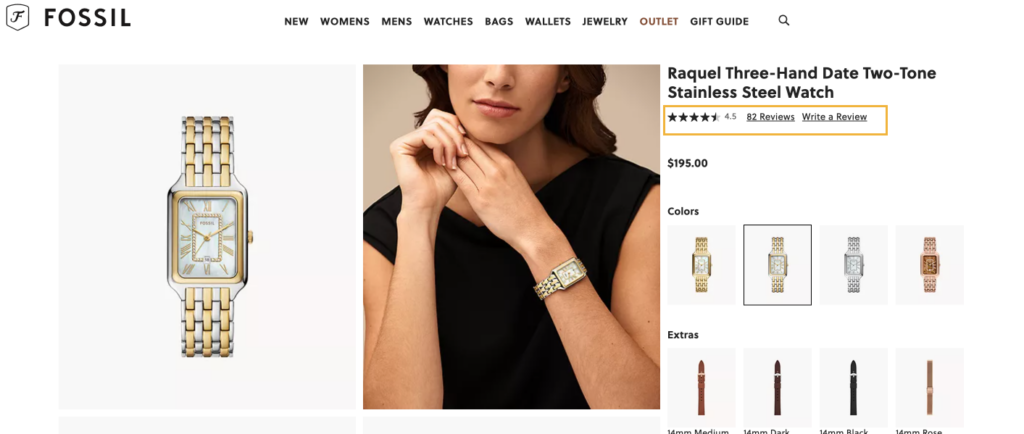
It’s the Carmen Shopper bag product page on the official Fossil website. Right under the title, there’s a star rating and reviews link that can direct to the section of the page with client feedback.
The “Review Snapshot” collects the average rating based on user reviews. Furthermore, the “What do you want to know about this product?” section is useful and engaging too.
Summing Up
What is the easiest way to increase eCommerce traffic and conversion rate? Start with improving your product pages. When designing product pages have in mind the best practices that we mention. Make them as value-packed as possible to encourage people to buy more things. Remember to arrange everything in a user-friendly way. Here is what you can do:
- clearly explain the purpose of your product and how to use it;
- have keywords to match user intent;
- stress the product’s advantages;
- include all of the facts you’ll need to make a buying decision, such as weight, size, and materials;
- showcase reviews;
- speak the language of your target audience;
- use quality visuals, such as videos and images.
Kate Parish is the CMO at Onilab, a web development agency. Being a top executive in a company specializing in eCommerce, she spends much time researching new approaches in UX/UI design, Magento PWA development, and headless commerce on the whole. At the same time, Kate strives to keep up with the latest developments in digital marketing to modify the company’s promotional strategy accordingly. Her primary areas of interest are SEO, branding, and SMM.

