A smooth and easy checkout process is crucial for e-commerce success. A well-optimized checkout page for your Shopify can boost your conversion rates and reduce cart abandonment. However, optimizing a checkout page that meets the needs of your customers can be challenging.
To help you create a checkout page that maximizes sales and provides a positive customer experience, we’ve compiled 10 principles for good checkout page optimization for Shopify stores. From clear and concise communication to streamlined navigation and trust-building elements, these principles can guide you in creating a checkout page that converts visitors into loyal customers. So, let’s dive in!
Why the checkout page optimization for Shopify matters
The checkout page optimization of your Shopify is a critical determinant of its success. As a crucial component of the sales funnel, checkout pages can either make or break someone’s decision to purchase and shape their journey through the sales flow.
And a poor checkout experience can frustrate customers, increase shopping cart abandonment rates, and negatively impact your bottom line.
Conversely, a well-optimized checkout page can provide a seamless and enjoyable shopping experience, increase your conversion rates, and foster customer trust and loyalty. For any online business seeking to maximize sales and customer loyalty, investing in good checkout page optimization is vital. Neglecting the checkout page optimization can lead to lost sales and revenue.
Now, let’s explore how checkout page optimization for Shopify can increase your conversion rates and reduce cart abandonment.
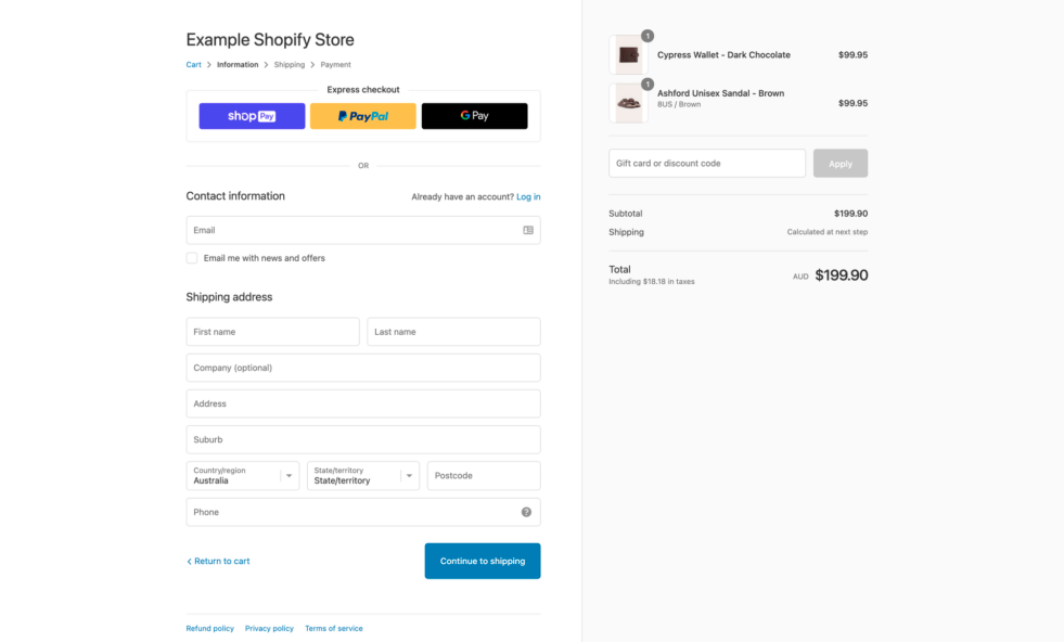
CTA button placement and optimization
The Call-to-Action (CTA) button is the most important element on your checkout page. It’s the button that users click to complete their purchase, so it’s crucial that it’s easy to find and stands out from the rest of the page.
By making the CTA button prominent, you can guide users to take the final step and complete their transactions.
To make the CTA button stand out, use a contrasting color that is different from the rest of the page. This will make it more noticeable and draw the user’s attention to it. The text on the button should also be clear and action-oriented, such as “Complete Purchase” or “Place Order”. This helps to clearly communicate what the button does and encourages users to take action.
When it comes to the CTA button on the checkout page, placement is key. You want to make sure it’s easy to find and in a prominent position, such as at the bottom of the page or in the center. Placing it in an obscure location could lead to frustration and potential cart abandonment, so it’s important to be strategic about its placement.
The power of minimalist checkout page for Shopify
When designers want to create simple, clear, and functional designs, they often turn to minimalism.
This approach works especially well in checkout page optimization because it can guide customers through the process and reduce the chances of them abandoning their shopping carts.
So, to make an effective checkout page, it’s important to keep unnecessary distractions or promotional content out of the picture. Instead, focus on the essential elements that lead customers through the checkout process, like the shopping cart, shipping and billing information, payment options, and order confirmation.
When you remove anything that isn’t essential, you can create a checkout experience that’s streamlined and prioritizes the customer’s preferences.
However, it’s also important to balance minimalism with functionality. While you want to avoid clutter and distractions, you still need to provide customers with the information they need to make informed purchasing decisions.
Importance of clear progress indicators in checkout page optimization
Clear progress indicators are an essential element of effective checkout page optimization.
They help customers feel in control of the process and understand what steps they need to take to complete their purchase. When customers know what’s coming next and how many steps they need to go through, they are less likely to abandon their cart and more likely to complete their purchase.
When optimizing a checkout page for your Shopify store, it’s important to keep in mind that customers can become easily frustrated if they feel lost or confused. By providing clear progress indicators you help prevent this frustration and ensure a smoother checkout experience. This is especially important for customers who are in a rush or have a low tolerance for confusing interfaces.
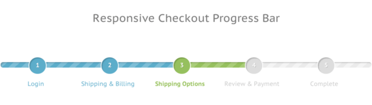
Ultimately, incorporating clear progress indicators into the checkout page help reduce cart abandonment rates and improve customer satisfaction.
By keeping the checkout process clear, concise, and transparent, you can make sure customers feel confident and in control as they complete their purchases.
Simple checkout page navigation
To create a smooth and hassle-free checkout experience, it’s crucial to ensure that customers can easily navigate through different stages of the process. This means providing simple and intuitive ways for customers to move back and forth without losing any information they’ve already entered.
One effective way to achieve this is by incorporating clear and prominent back and forward buttons or a breadcrumb trail that displays the customer’s progress through the checkout process. This helps customers keep track of their progress and navigate to previous stages if they need to make changes.
According to research, nearly 18% of online shoppers abandon their shopping carts due to a lengthy and complicated checkout process.
Another essential aspect of simple navigation is ensuring that customers can move through the process without losing any information they’ve already provided. This can be achieved by saving their inputted information as they move forward or by allowing them to review and edit their information on previous stages.
Clear pricing can help build customer loyalty
One of the most important factors for building trust with your customers is transparent pricing. By clearly showing all costs associated with a purchase, you can prevent any unexpected surprises and promote trust in your brand. This includes not only the cost of the product, but also taxes, shipping fees, and any other additional charges.
Customers want to feel confident in their purchasing decisions, and providing transparent pricing is a key component of that. It shows that you value their trust and are committed to providing a fair and honest shopping experience.
Additionally, transparent pricing can help reduce cart abandonment and increase customer satisfaction, as customers are more likely to return if they feel they can trust your brand.
Hidden costs during the checkout process can significantly reduce the likelihood of a successful transaction. Customers may be hesitant to complete a purchase if they discover unexpected fees, such as shipping or taxes, during the checkout process.
This can lead to an increase in cart abandonment rates and a decrease in overall sales.
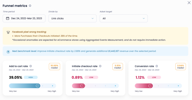
If you are experiencing a high add-to-cart rate but a low checkout rate, it’s important to take a closer look at your checkout page. Are there any hidden costs or confusing elements that could be causing customers to abandon their carts?
Using Lebesgue: AI CMO can help identify areas for improvement and provide actionable tips to optimize the checkout process.
Nearly half (49%) of online shoppers abandon their shopping carts because the additional costs at checkout, such as taxes and shipping fees, were too high.
Benefits of optimizing the checkout page for mobile
Mobile-friendly optimization is a must-have for any website, including the checkout page.
With more and more customers making purchases on their mobile devices, it’s essential to ensure that the checkout process is fully responsive and optimized for a seamless experience on any screen size.
A mobile-friendly checkout page ensures that customers have a seamless experience, no matter what device they’re using. This means that customers won’t have to zoom in and out or struggle to enter information, which can be frustrating and lead to cart abandonment.
To make your checkout page mobile-friendly, you should use responsive design principles, such as using a single-column layout, large buttons, and clear fonts that are easy to read on smaller screens. Also, make sure that the page loads quickly, as slow load times can deter customers from completing their purchases.
Improve conversion rates with a guest checkout option
When it comes to providing a smooth and hassle-free checkout experience, offering a guest checkout option is key. Some customers may not want to go through the hassle of creating an account or signing in, especially if they are only making a one-time purchase. By providing the option to checkout as a guest, you can reduce any unnecessary barriers and encourage customers to complete their purchases quickly and easily.
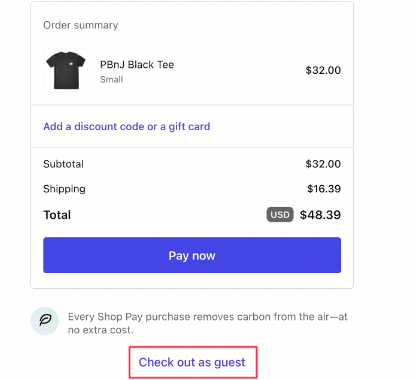
It’s important to note, however, that offering a guest checkout option doesn’t mean you should disregard the importance of account creation. You can still offer the option to create an account at the end of the checkout process after the customer has completed their purchase.
This provides them with the opportunity to save their information for future purchases, creating a more streamlined experience for returning customers and building customer loyalty over time.
Research shows that approximately 24% of customers abandon their online shopping cart when asked to create an account on the site.
How to make input fields clear and easy to understand
When it comes to online shopping, a smooth and seamless checkout process is essential for converting visitors into customers. Clear input fields play a vital role in creating a user-friendly experience, especially when it comes to mobile users who may have limited screen space.
That’s why you should make good use of mobile forms so your users have a better experience when they are away from their computers.
By using easy-to-understand labels and placeholder text, you can help customers quickly identify what information is required and reduce confusion. This is particularly important for those who are in a rush and need to complete their purchase quickly.
But it’s not just about making things clear – real-time validation is also crucial in preventing customers from submitting incorrect data. Whether it’s checking for valid email addresses or credit card information, real-time validation can catch mistakes before they become a problem.
This saves users the frustration of having to go back and correct errors, and ultimately, it can lead to fewer abandoned carts and increased conversions.
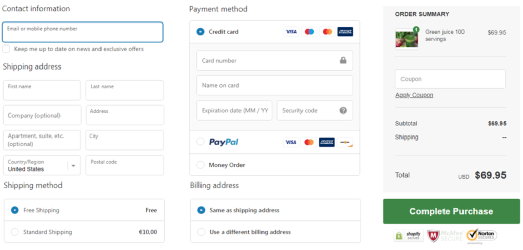
The role of multiple payments options in e-commerce
Offering a variety of payment methods also helps to build trust with your customers. Some customers may be hesitant to provide their credit card information online, but by offering alternative payment options such as PayPal, Apple Pay, or Google Pay, you can give them the peace of mind they need to complete their purchase.
Additionally, providing multiple payment options can also increase conversion rates by reducing cart abandonment. If a customer is unable to complete their purchase due to a lack of preferred payment options, they may abandon their cart and look for alternatives.
By offering a range of payment methods, you can reduce this risk and keep customers engaged with your website.
Build customer trust and confidence
Trust signals are crucial in building trust with your customers, especially when it comes to their personal and financial information. Displaying trust signals such as security badges, customer testimonials, and a clear return policy can reassure users that your website is safe and legitimate.
When users see trust signals, they are more likely to feel comfortable sharing their personal and financial information with you, which can lead to increased conversions and customer loyalty. Additionally, trust signals can help differentiate your website from others and give you a competitive advantage.
And that’s it! This is our list for checkout page optimization for Shopify.
Having up-to-date discount codes is crucial for ensuring a smooth and successful checkout process. When customers encounter an expired or invalid discount code, it can be frustrating and cause them to abandon their purchase altogether.
Summing up
There you have it! These practical tips and best practices cover everything you need to know to optimize the checkout page for your Shopify store.
From ensuring clear input fields to offering multiple payment options, building trust with customers, and using transparent pricing and call-to-action buttons – these strategies can help you enhance the user experience, boost customer satisfaction, and ultimately increase sales.
Give them a try and see the difference for yourself!