The bounce rate of your Shopify store directly impacts your sales.
When a visitor exists your page without taking action within seconds of opening it, they’re not interested in buying from you. But when a large volume of visitors does this, it’s a matter of concern for your business.
This high volume of unpleased visitors notifies Google of these potential problems in your website:
- Technical errors
- Low-quality content
- Poor web design
- No mobile optimization
- Slow loading speed
These factors determine the overall shopping experience of your Shopify store and impact your organic ranking.
One way to avoid this is by digging deeper into your website analytics and fixing issues causing high bounce rates. An even better approach is to follow best practices to maintain a healthy bounce rate in your Shopify store, which we’ll explore in this blog post.
What is a Good Bounce Rate For Shopify
Shopify data shows that most e-commerce businesses see bounce rates from 20% to 40%.
What’s a good bounce rate varies by industry and goals. But, if your e-commerce site is well-designed and easy to use, you might aim for a lower bounce rate, closer to 20%.
How does Shopify calculate the bounce rate
Generally, the bounce rate is calculated using the following formula:
Rate = Number of single-page visits / the total number of visitors
However, you must be very careful about the metrics you’re measuring.
Suppose a visitor spends a significant amount of time on a product page. They have similar pages opened in the consequent tabs, and after putting in much thought, they end up closing your tab.
This is not a true bounce. A true bounce happens when the visitor doesn’t engage with your page at all, and something about it (be it quality or experience) puts them off.
Here are five tips for maintaining your Shopify store’s bounce rate and increasing the conversion rate.
How to measure your Shopify store bounce rate
Bounce rate, a key part of SEO, is tracked using tools like Google Analytics. These tools offer valuable insights into your website’s performance, such as page views, traffic, time spent on pages, and clicks.
By implementing a web analytics tool on your site, you can easily monitor your bounce rate and other metrics. This helps you understand where visitors are leaving your site and what improvements you can make to keep them engaged.
How to Reduce Bounce Rate
If your Shopify store has a high bounce rate, consider these strategies to lower it:
- Optimize your website content
- Make design and navigation seamless
- Make sure your landing pages actually deliver
- Reduce friction in the checkout process, and
- Optimize the loading speed.
Now, let’s put these strategies into action to reduce your bounce rate.
1. Optimize your website content
Everything from your product descriptions to blog content and product videos impacts a visitor’s engagement on your page.
Optimize and fine-tune these aspects of content in your Shopify website:
Product descriptions
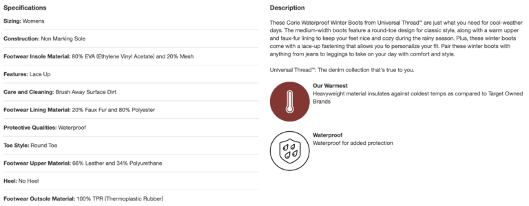
No matter how attractive or responsive your website is, they’ll leave if the product descriptions don’t sound appealing to your prospects. Keep your product descriptions short and concise while focusing on your product’s unique selling proposition (USP).
For example, check out this description for boots by Target that covers everything about the product so that it’s easy for visitors to scan and get the gist.
Add subtitles to your videos
It’s a good practice to create product videos that showcase your product dimensions, design details, and quality—it helps address their concerns and reservations about your product. Adding subtitles to your videos offers visitors an even more pleasant buying experience.
- They reduce the chances of any misinterpretation of product features
- It offers the prospects to shop from anywhere—from a crowded cafe to a noisy bus stop—without having to hear the audio word-to-word
- They compensate for the lack of audio quality
One can generate subtitles automatically with Happy Scribe or similar tools or spend hours transcribing audio to text manually. We recommended the former approach as it helps you save time and create high-quality video content that drives conversion.
2. Make design and navigation seamless
About 94% of first impressions are formed based on design only. This impacts the visitor’s decision about considering doing business with you. Address the following factors while optimizing your store’s design.
Strategically organize the menu
A visitor should be able to figure out the categories and selection of products you offer in one glance.
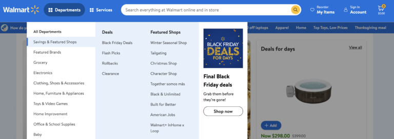
For example, check out how Walmart has organized its product menu on its website. Since they have a wide variety of products in a wide range of categories, they’ve used layered navigation to help visitors find the category of product they are looking for.
On top of that, notice how beautifully they’ve made their ‘Black Friday Deals’ stand out.
Also, notice how they’ve added labels for each product category, eliminating any chances of confusion for the visitors. With this level of categorization and ongoing deals showing up, anyone who intends to purchase a specific product will probably end up purchasing it without much thought.
Make the CTA stand out
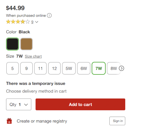
CTAs play a huge role in driving a store’s conversion—they need to be the appropriate size, color, and shape and properly placed and aligned.
Take inspiration from Target’s perfect CTA alignment that stands out among the rest of the content. Moreover, they’ve displayed their ratings at the top of the product page, which builds credibility and is a huge conversion factor for potential buyers.
3. Make sure your landing pages actually deliver
Often, the search campaign ads or results shown in the SERP don’t show relevant content on the landing page. Many eCommerce sites show ads for a particular product but redirect their visitors to their homepage, which results in a huge disappointment.
Reason—the visitors had specifically entered a search query with the intent of finding a product. When they’re led to a generic home page, they feel misled and misinformed. Naturally, they will not like to spend a few more minutes searching for the same product in the store.
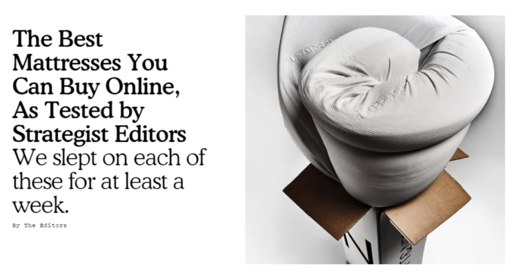
For example, we looked up the keyword ‘mattress online’, and this particular search result caught our attention.

When we clicked on the URL, the landing page delivered exactly what the title and meta description said—a detailed comparison of the best mattresses in 2022.
Landing page optimization techniques
- Maintain consistency in branding and design for the ad and landing page. The landing page must be the extension of the ad your visitors were shown.
- Keep the title and meta description as clear as possible—avoid using clickbait-y and misleading content.
- Keep your landing page design clutter-free and easy to follow. Make sure the CTAs stand apart, and the copy is compelling enough to hook the visitors.
4. Reduce friction in the checkout process
One of the most frustrating parts of a terrible online shopping experience is the slow checkout process. First, a mandatory login before checkout adds more time to the process, and not many are comfortable doing it. Then, they ask for unnecessary details to fill up, leading to more frustration.
Moreover, design defects make things only worse in the whole purchasing experience, as a result of which the visitor simply abandons the cart and leaves.
Optimize checkout in your Shopify store
- Highlight the ‘add to cart’ button and make sure visitors also have the option to see how many items they have in their cart.
- Keep the checkout form fields to a minimum. Do not force buyers to enter their personal information that’s not payment-related.
- Minimize redundancy in the checkout process.
- Incorporate autocomplete and drop-downs to help speed up the process.
- Enable guest checkout in your store. This ensures you’re not coming across as too pushy and ignorant of their convenience.
- Implement chatbots or make it easy for visitors to reach out to you for their queries. Make the experience personalized and quick.
- Showcase the product cost (including shipping fee and other taxes) on the product page itself. Avoid revealing the total cost toward the end of the checkout process.
5. Optimize the loading speed
A survey by Unbounce shows that 70% of consumers admitted that a website’s slow speed impacts their purchase decision. That shouldn’t be a big surprise, considering how small the attention spans of online shoppers are.
Ideally, a Shopify store should take a second or less to load. However, sites with a large inventory of products categorized on multiple pages find that difficult to achieve.
Tips for optimizing the loading speed
- Choose Shopify apps developed by well-reputable companies, particularly those having a rating of 4.5 stars or more. Read the app description, compare their pricing and features, and read the user reviews. Moreover, see if the app developers also offer support for any issues you might face later.
- Choose responsive themes that are light and have simple features.
- Optimize the images used on the website. Use hero images over hero sliders. Complex functionalities take up more processing time, which hampers the site speed.
- Unnecessary redirects affect your site speed. Don’t overuse them, and fix broken pages on your website.
Summing Up
Bounce rate is often considered an afterthought when Shopify store owners start noticing a tank in their conversion rates. It’s an important metric they must take into account from the beginning of launching a store, specifically in the planning and design stages.
However, it’s never too late to implement the best practices to avoid having your bounce rates go high. All you need is to make sure you’re offering the best shopping experience to your visitors in terms of design, content, messaging, and usability, and you’re gold.
Deepali is an engineer-turned-freelance writer for B2B SaaS, writing actionable long-form content for marketing, Cybersecurity, and HR-Tech companies. When she’s not writing, she’s engrossed in a cozy murder mystery novel with a cup of hot chocolate!


