Whether you’re looking to start a successful Shopify business or want to improve your current one, many tips & tricks can help you achieve that. If you’ve been following our blog for a while, you know that we’re all about sharing up-to-date, industry-best practices regarding Facebook, TikTok, and Google ads. But in today’s blog post, we decided to share our top 10 Shopify tips that you and every merchant need to know to successfully increase Shopify sales.
Ready? Let’s dive in!
Increasing Shopify Store Sales
Increasing your Shopify sales means increasing the overall revenue generated through your Shopify store. This can be achieved through various strategies, such as:
Attracting more visitors: This means bringing more potential customers to your online store. More visitors increase the chances of making sales.
Converting visitors into customers: Once people visit your site, you need to persuade them to purchase something. This could involve making the website easy to navigate, providing clear and compelling product information, and having an easy checkout process.
Increasing order size: Encouraging customers to purchase more products or more expensive products each time they make a purchase. This can be done through techniques like upselling (suggesting a better version of a product) or cross-selling (suggesting related products).
Encouraging repeat purchases: Motivating customers to come back and purchase from your store again. This can be achieved by offering excellent customer service, sending follow-up emails with special offers, and creating loyalty programs.
So, increasing your Shopify sales means getting more people to visit your store, turning those visitors into buyers, getting those buyers to spend more, and encouraging them to come back and purchase again.
Key Factors to Consider for Increasing Shopify Sales
When looking to increase your Shopify sales, understanding market trends is crucial. Stay updated on industry developments and consumer behavior changes.
This awareness helps you adapt your product offerings and marketing strategies to align with current demands. For example, if eco-friendly products are trending, consider incorporating sustainable options into your inventory.
Competitor analysis is another aspect you need to have an eye on. Regularly monitor your competitors to understand their strengths and weaknesses. By analyzing their product range, pricing strategies, marketing tactics, and customer feedback you can identify gaps in the market and areas where you can differentiate your store.
Building a strong brand presence is essential for long-term success. Develop a consistent brand identity and voice across all channels. Engage with your audience through social media, email marketing, and content creation.
Building a community around your brand can foster loyalty and encourage word-of-mouth referrals.
Finally, excellent customer service can set your store apart. Provide prompt and helpful responses to inquiries, offer hassle-free returns, and go the extra mile to ensure customer satisfaction. Happy customers are more likely to become repeat buyers and recommend your store to others.
How to Increase Shopify Sales?
Increasing Shopify sales involves several strategic steps:
Keep your CTAs above the fold
Display only key product information
Allow users to continue shopping from the checkout page
Add social proof to your product pages
Checkout your advertising setup
Follow up on abandoned carts
Offer discount codes
Learn from your competitors
Check your page load time
Communicate shipping costs upfront
The best strategy to increase e-ommerce sales depends on your business model, marketing budget, and the strengths and weaknesses of your sales funnel. These ideas can help you increase traffic to your online store, boost conversions, and improve customer retention and loyalty:
Keep your CTAs above the fold
A call to action is one of the most important parts of any website. Their purpose is to guide visitors through your website and encourage them to take a specific action. Therefore, it is extremely important to not only choose the appropriate design of your call to action but also the best possible placement.
Generally, the best practice involves placing your primary call to action above the fold. That’s simply because there are still many visitors that don’t end up scrolling beyond the fold.
In fact, according to Google’s study, content that was placed above the fold had 73% visibility, while those below the fold had just 44%.
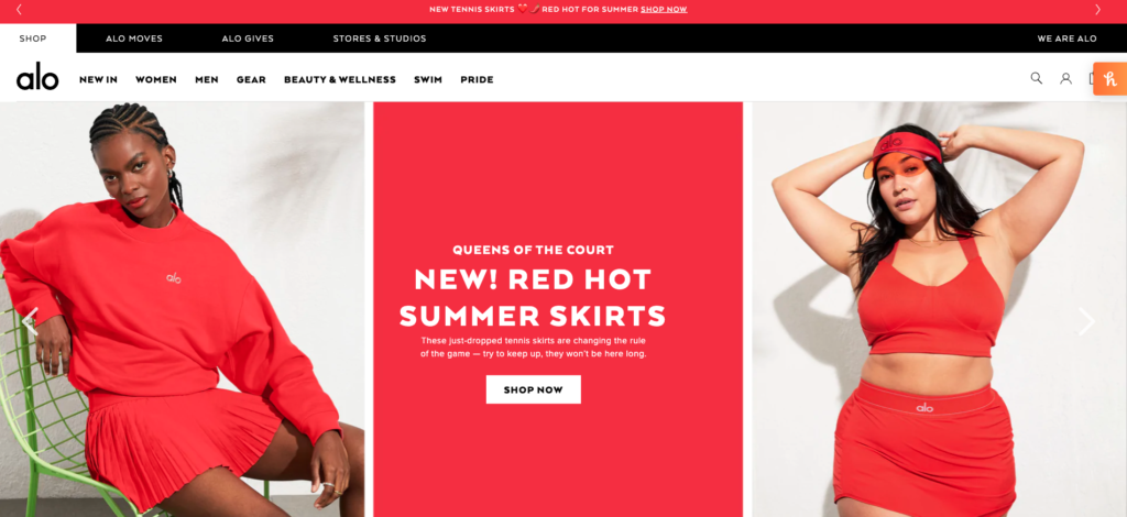
Below you can see an example of well-thought UX and UI design. The “Shop now” call to action is clear, simple, and visible as soon as you land on the homepage.
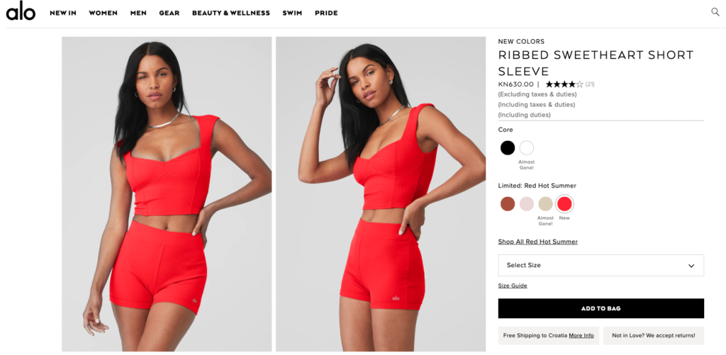
This best practice not only applies to your homepage but also to all the important pages on your website. So naturally, you’d also want to optimize your product pages and the primary CTA there, which in this case would be the “Add to bag” or “Add to cart” button.
Display only key product information
Another important part of your product page is the product description. Here you also want to take into consideration how much information you’re presenting above and below the fold.
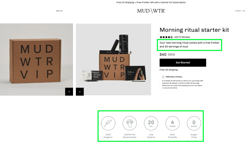
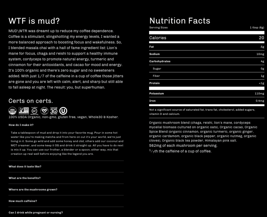
You want to include only critical product information above the fold, following a clear call to action. Notice how in the example below you’re only seeing one sentence about the product followed by 5 simple two-word product descriptions/benefits.
As you scroll down the page, you can see much more information about the product, some nutrition facts, and answers to frequently asked questions. Now imagine having this block of text above the fold.
As a customer, you would probably be overwhelmed with so much information and wouldn’t know where to focus. Therefore, it’s better to include all this additional information below the fold, in case the user has some doubts about the product.
Allow users to continue shopping from the checkout page
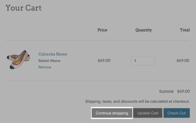
It is also considered good practice to give users the option to add more products through the entire purchase process.
You can do that by simply adding a “continue shopping” or “add more products” call to action button next to the “checkout” one, making it easy for them to continue shopping after they’ve added items to the cart. Also, notice how close all three calls to action are to each other, but only one of them is different. In the checkout process, the checkout button is always considered the primary one and therefore should be more visible than any other call to action.
Add social proof to your product pages
Another important part of your product page, and generally, your website is social proof.
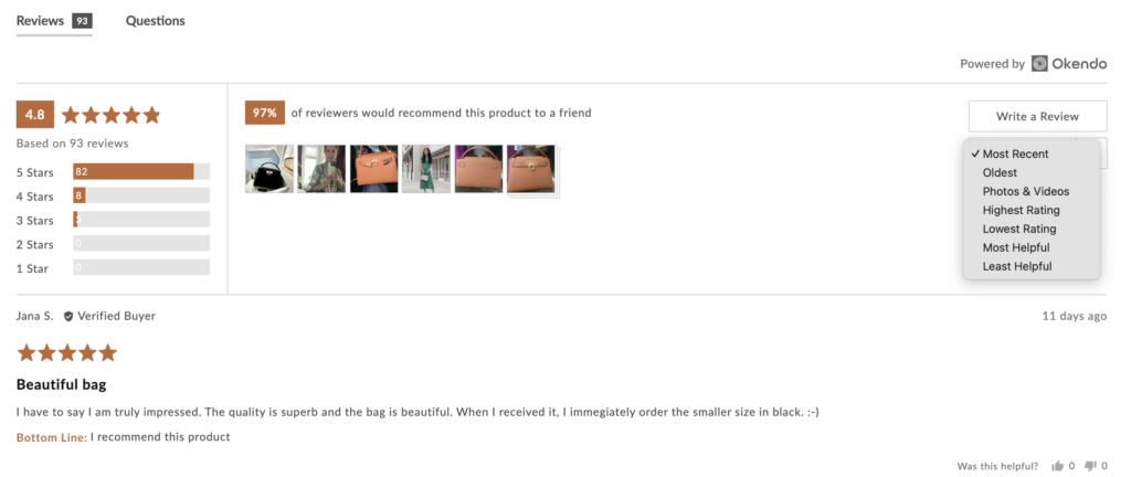
People like to reassure themselves about the product they are about to buy, so make sure to add some type of social proof on your website. This can be customer testimonials, real-time stats, case studies, or something else – the choice is up to you. Below you can see an example from Alo Yoga’s product page. As we saw from the screenshots earlier, all the important and product-related information is placed above the fold, while user reviews are placed below the fold, to reassure visitors about their product.
Check your advertising setup
Whether you’re a Facebook ads beginner or a total pro, there’s always a possibility that you’re making a mistake in your ad setup that is then hurting your overall performance.
But the good news is that by performing an ad account audit you can ensure that your setup is on point and that you’re not making any mistakes.
There are many ways to do an ad account audit, but if you’re a Shopify business and you’re looking for a fast and accurate solution, our Setup Red Flags feature might be the perfect fit.
After you connect your Facebook ad account with the Lebesgue app, you’ll immediately see your ad account score which is calculated based on how many red flags (mistakes) we’ve found in your ad setup.
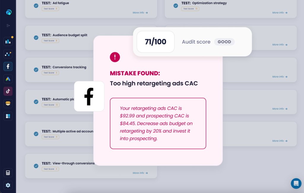
There are 13 tests in total that we run for Facebook Ads, 9 for Google Ads, and 9 for TikTok ads. Apart from seeing which tests you’ve passed, you’ll also see which ones you’ve failed and how to easily fix them to increase your score and ROI.
Follow up on abandoned carts
Around 75% of shoppers leave e-commerce websites with items still in their basket.
According to a case study done by SaleCycle, sending an abandoned cart email within 20 minutes can derive about a 5.2 percent conversion rate.
Automated emails are a great way to recover abandoned checkouts. As we previously mentioned, around 87% of customers abandon their carts during checkout.
So not contacting these customers leaves a lot of potential conversions in the air. Depending on your e-commerce platform, you may already have a built-in abandoned cart flow. For example, if you use Shopify, you probably already have a Shopify abandoned cart flow.
But if you want to spice up the customization of your messages, there are many Shopify apps you can use.
So when you notice a drop in your conversion rate, be sure to check your abandoned cart flow. A potential bottleneck could be that the flow is not triggering when someone abandons their cart, leaving behind potential sales that could have been captured with an abandoned cart email
Offer discount codes
One of the most popular lead generation methods is offering discount codes. Many websites offer discount codes on first orders in exchange for users’ email addresses.
These pop-up forms automatically appear on the website either after visitors want to exit the page or when they scroll down the page they’re on.
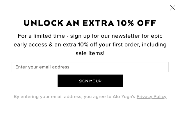
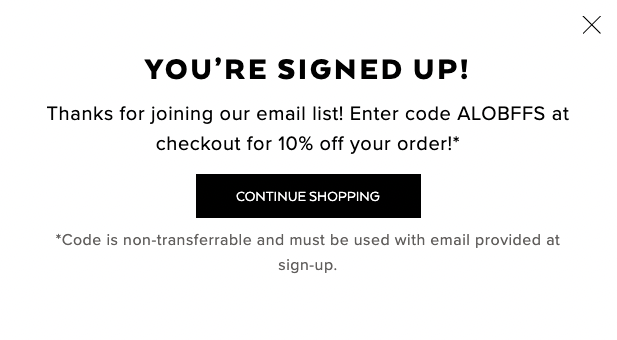
However, in this case, you gotta make sure of one thing. When offering a discount code through the pop-up form, make sure to display the code directly in the form right after someone leaves the email address. Avoid saying “Check your inbox to unlock the code” or something similar because it will only defocus users from purchasing.
Learn from your competitors
Whether you’re just starting a Shopify business or have been running it for a while, performing a competitor analysis should be an essential part of your marketing plan.
By analyzing your competitors’ websites or Facebook and Google ads you can not only pinpoint what are their strengths or weaknesses but also gain some inspiration to enhance your ad copy, creative, and much more.
And the good news is that you don’t have to spend countless hours on making a full competitive research all by yourself.
We’ve got you covered with our Competitor Analysis feature – built specifically for Shopify merchants that want to understand their competition, how they are growing, and what they are doing in terms of their marketing that is helping them to grow.
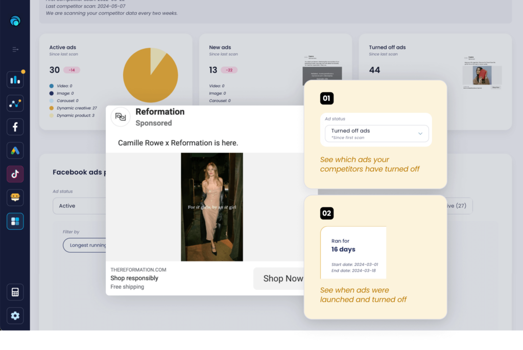
The feature is super intuitive, easy to use, and has a lot of great functionalities. Other than being notified when a competitor launches new ads and being able to analyze their ad copy or creative, you can also analyze their market growth on a monthly, quarterly, and half-yearly period to identify the biggest players on the market.
If you’re interested in discovering and analyzing your competition, you can do so for free with the Lebesgue app. Simply hit the button below and start your 14-day free trial.
Check your page load time
Site speed has a huge impact on your Shopify store conversion rate.
In fact, 47% of consumers expect websites to load in only two seconds or less. So if your website is buggy and doesn’t load fast, visitors are most likely going to bounce and purchase from your competition. So if you’re not sure how slow or fast your website is, now’s the time to check it out.
Just open PageSpeed Insights, and put your page URL into the search section.
Communicate shipping costs upfront
Nobody likes to be surprised with additional shipping costs or taxes in the checkout process, right before purchasing.
So make sure to provide all that information upfront so that customers have all the information they need before they decide to purchase.
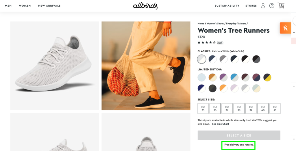
This will ensure you’re gaining their trust and preventing them from bouncing off and potentially purchasing from your competition. Below you can see Allbirds’ product page and how they are communicating “Free delivery and returns” just below the primary call to action.
Summing Up
Be sure to try out some of these Shopify tips on your store, you’ll be surprised how simple changes can boost your conversion rate and Shopify sales. For more Shopify-related content make sure to visit our blog and subscribe to our newsletter to receive product updates and stay up to date with key industry trends.

