Struggling with your Facebook ads CTR (Click-Through-Rate)? Not sure how to improve it? We know, we know – getting people to click on your Facebook ad can be a real challenge. But if you put the right tips & tricks to the test, the results will start coming. So, if you’re curious to find out what these tips are and how to improve your CTR, keep reading.
Using these extensions can improve the visibility and performance of your ads by providing more relevant information to users. It’s a valuable strategy for increasing click-through rates and overall engagement.
What is Facebook Ads CTR?
CTR stands for Click Through Rate and indicates the number of clicks you’ve received on your ad, compared to how many impressions your ad received. This metric is calculated as link clicks divided by impressions. So for example, if you get 10 clicks on a video that has a hundred impressions, you have a 10% CTR.
The average click-through rate on Facebook continues to be around 1.38%. We can see that in 2024, the CTR is higher compared to 2023 and 2024.
Also, in June 2024 CTR is higher than at the beginning of the year.
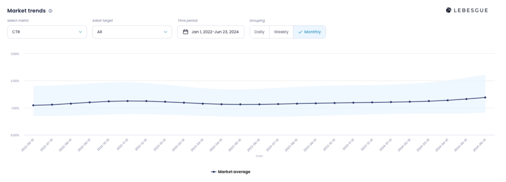
NOTE: In Lebesgue AI CMO, you can compare your CTR with industry benchmarks to see how you stack up against the competition.
CR or CTR? Which one is more important
Even though CTR is an important metric to look at, ultimately it all comes down to your Conversion Rate (CR). A higher CTR shows that your ads and creative is relevant to your audience. Therefore, the relevance score is going to be higher.
However, your conversion rate is far more important. Sometimes you might have a lot of clicks on your ad, but significantly fewer conversions.
In that case, you should investigate the reasons for your CR drop. The bottom line is – always make sure to evaluate your ads’ CTR together with the conversion rate and cost-per-click.
Keep an eye on the Facebook ads relevance score
The Facebook ads’ CTR plays a major role in the relevance score, which can help bring your CPC down. The relevance score goes from 1 up to 10 and essentially tells you whether your target audience is interested in your product or service.
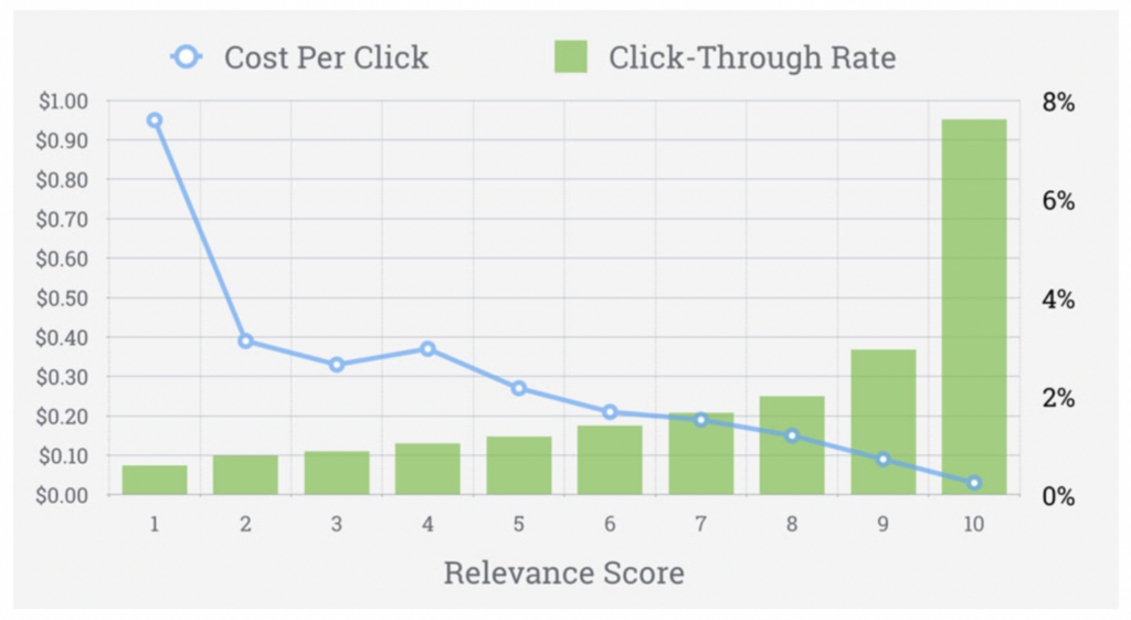
You can see here that a relevance score of 1, has a very high CPC and low CTR. So by having a high click-through, you generally have a high relevance score and low cost per click.
Work on your target audience for better Facebook Ads CTR
Before you start choosing your ad creative image and copy, you have to make sure that your targeting is relevant to the product or service you’re offering. If you’re targeting too broad of an audience, you may not reach people who have a high purchase intent. Similarly, if you’re showing ads to a very hyper-targeted audience, your ads may not be that effective because of too many targeting restrictions.
So, when building your audience, think about how many people are potentially interested in your product. Visualize your buyer persona, and craft your targeting based on interests, age, or characteristics they might have. For example, if the majority of your current customers are women, it might be a good idea to set your audience to reach women and exclude men.
The thing is, there’s no one-size-fits-all solution to building successful audiences.
Test, and adjust different targeting options, until you find an audience that responds well to your product.
Choose the right image
For someone to stop and pay attention to your ad, the image needs to be eye-catching. Don’t get us wrong, having a good ad copy is also important, but first, you have to make sure you have your audience’s attention.
Facebook found that ad images with less than 20% text perform better, though there is no limit on the amount of text that can be in your ad image. So try to use as little image text as possible, if at all.
For example, a clear value proposition is a great way to attract the eye. Spotify, below, uses the word “Free” both in the ad image and copy, to grab the user’s attention. Oh, and let’s not forget about the color scheme – they did a great job with that, too.
Different colors have a significant impact on our opinion of a brand or our purchase intent. Using colors strategically is more than just “what looks good”, so make sure to choose your color palette carefully.
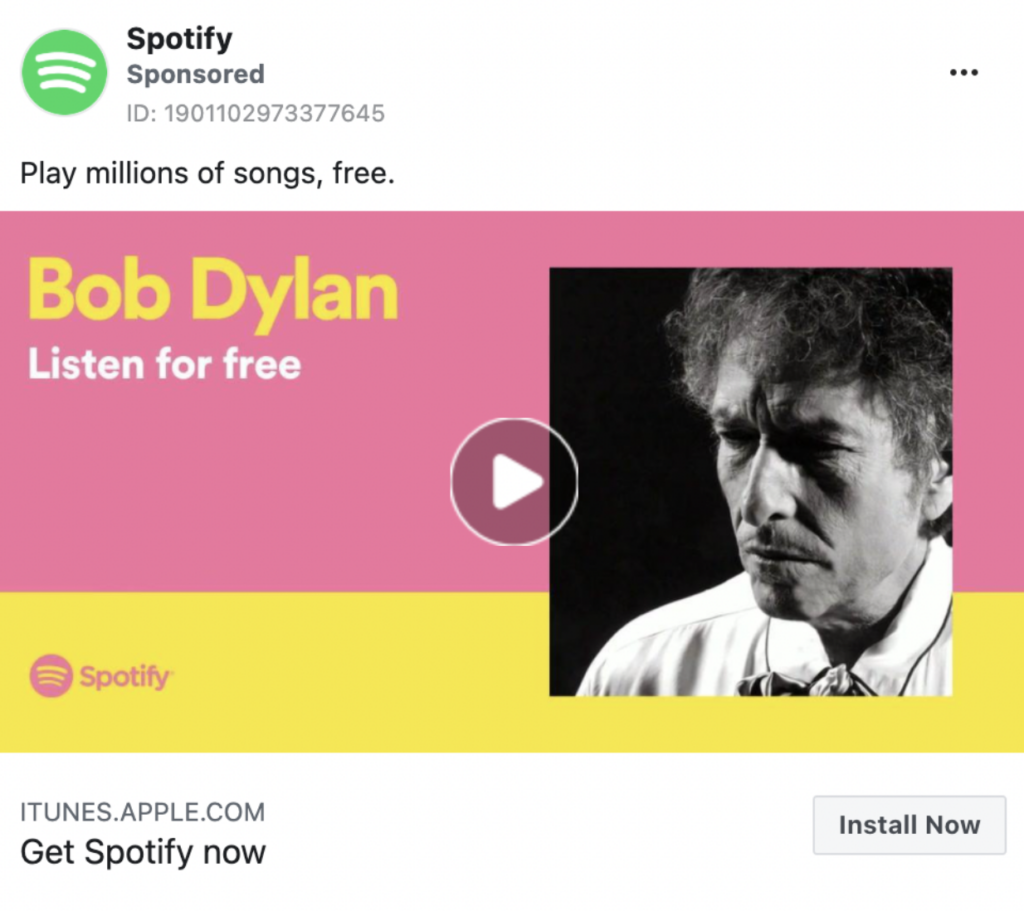
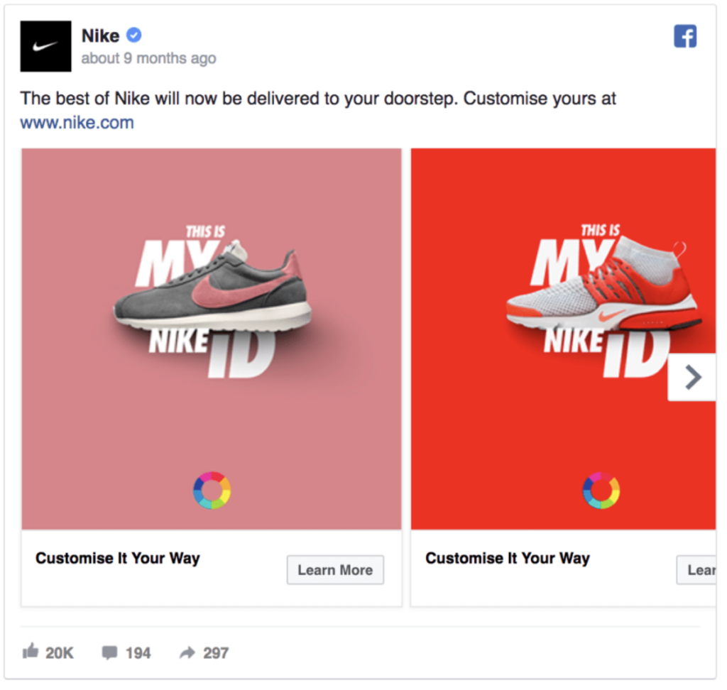
If you want to show multiple images in the same ad, try using the carousel format. You can showcase up to 10 different images or videos within a single ad, each with its link. This is a great way to highlight different products or specific details about one product. You can also get creative by telling a story about your brand that develops across each carousel card.
Keep it short & sweet
After analyzing 37,259 Facebook ads, AdEspresso found that to get the best results, your ad copy needs to be clear and to the point. And this not only refers to your primary ad text but also your headline and description.
According to the data, the ideal length for a headline is 5 words, 14 words for the main text, and 18 words for the description.
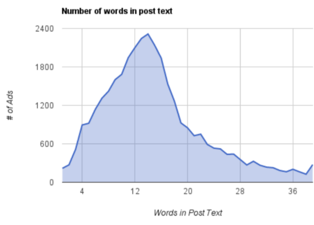
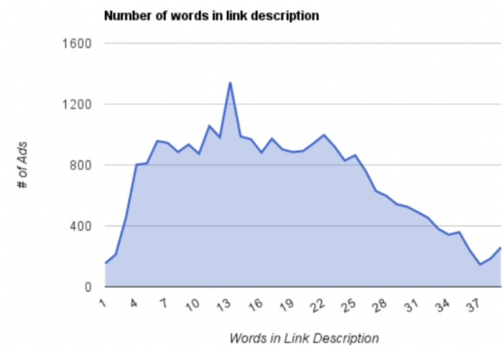
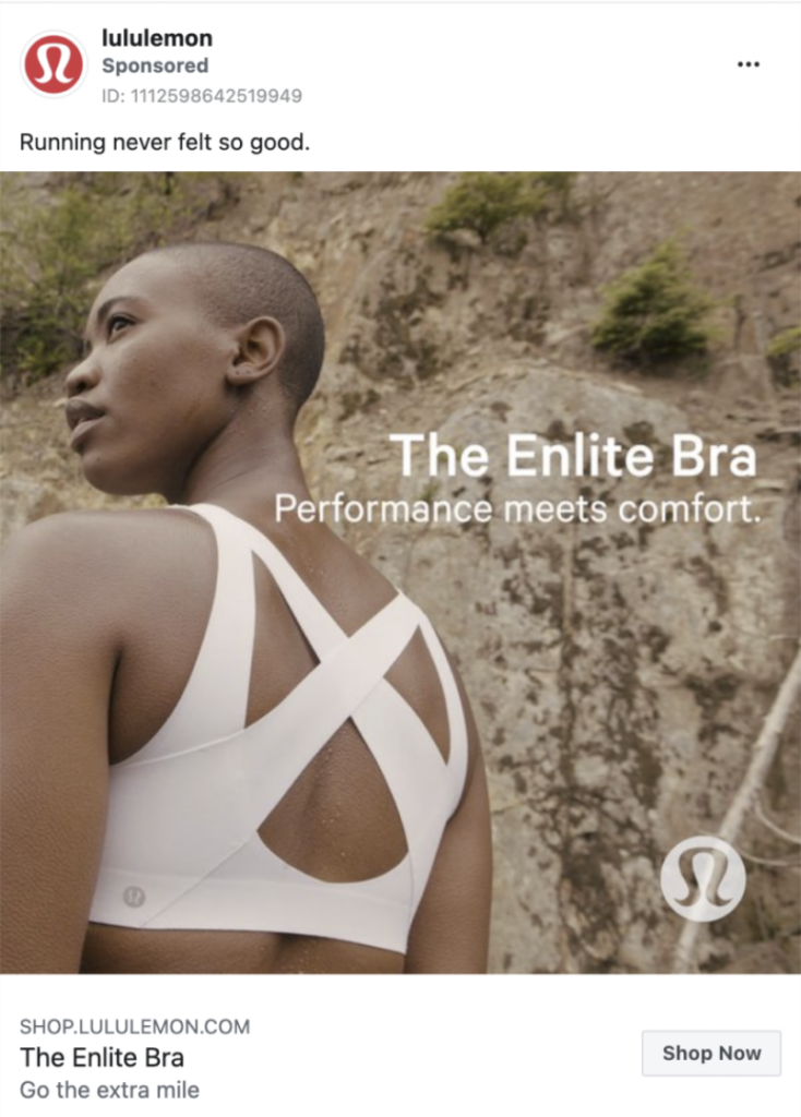
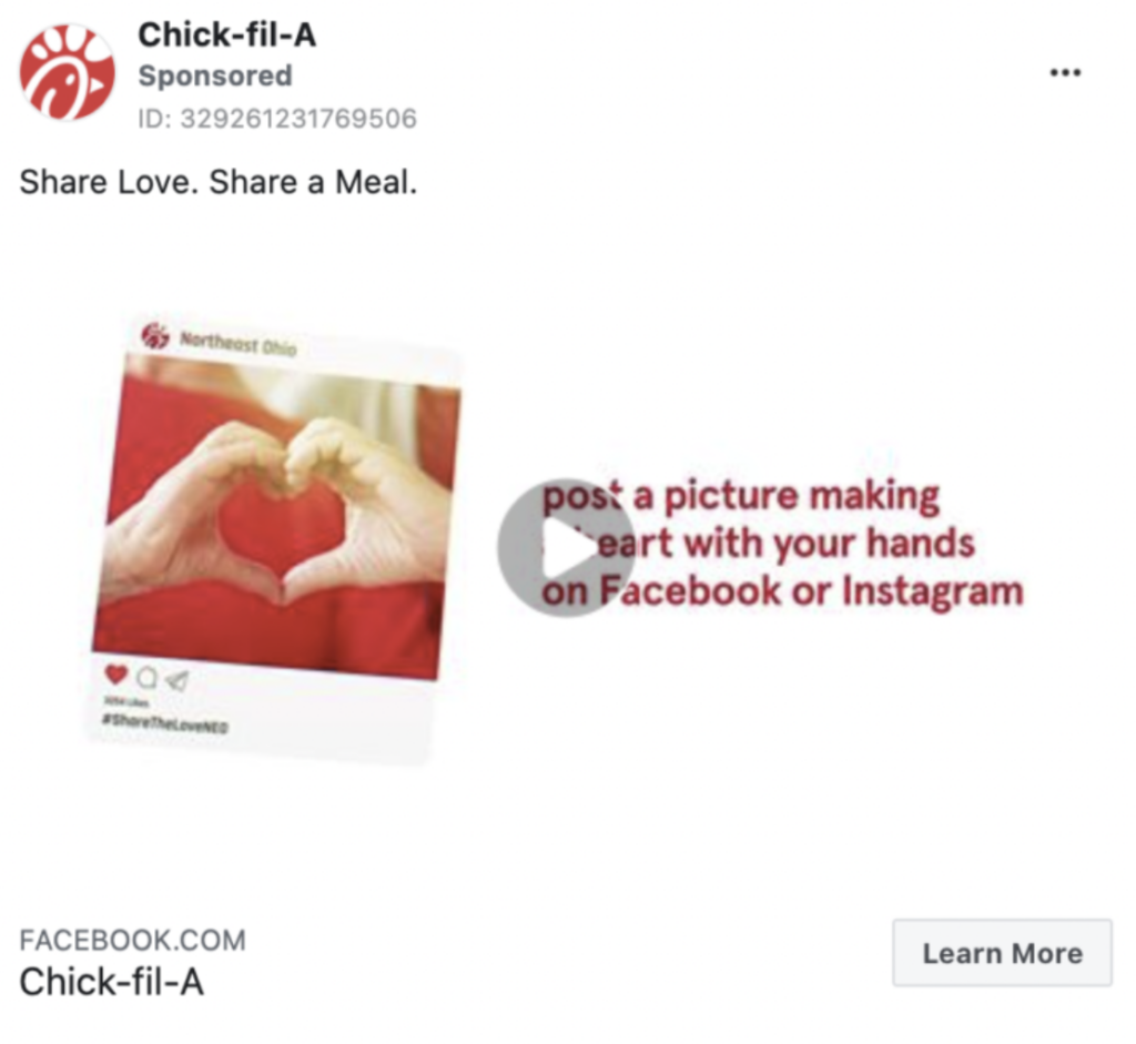
Whether the post is organic or paid, short and concise texts drive engagement, so make sure to keep your ad copy as short as possible. Here are some examples with a short, but engaging ad copy.
Wait, what about video ads?
For e-commerce advertisers, 16 to 20-second-length videos generated the best conversion rate.
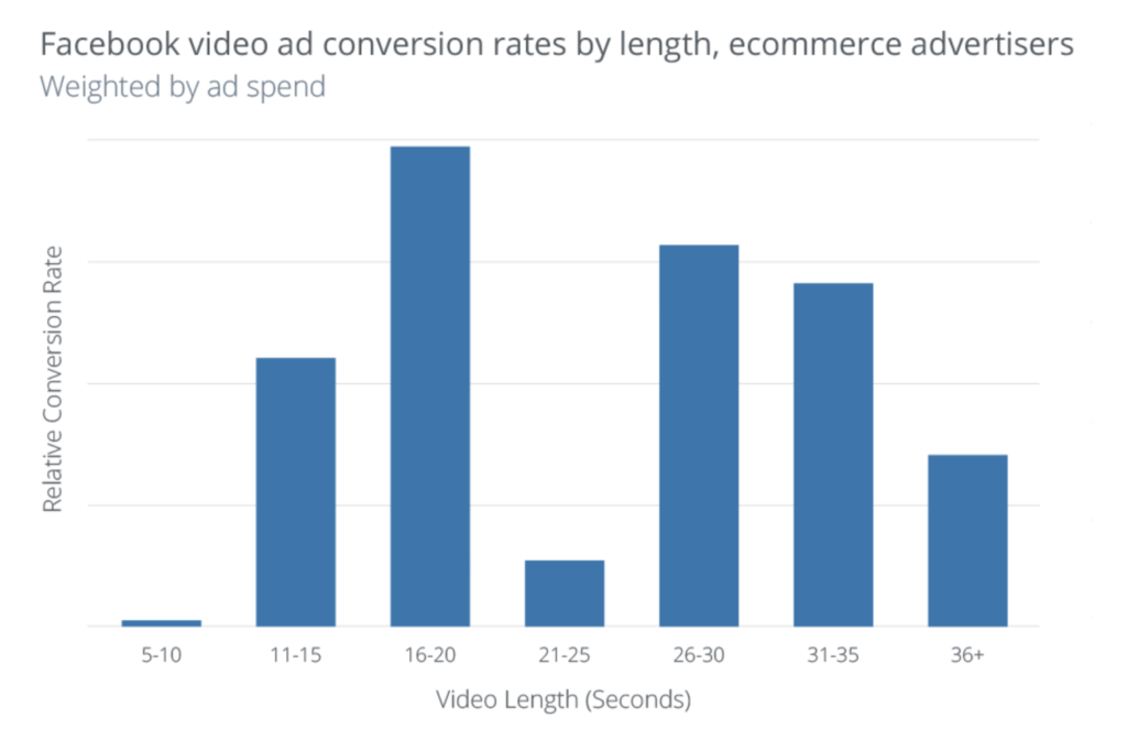
In-stream video ads the allowed length is up to 31 seconds, but Facebook recommends a length of 5-15 seconds. For standalone ads in the News Feed, Facebook also recommends video ads that are 15 seconds or shorter.
The reason for that is that shorter videos have higher completion rates, so you can successfully share your entire message. So, the bottom line is – whenever possible, keep your videos tight.
Experiment with headlines
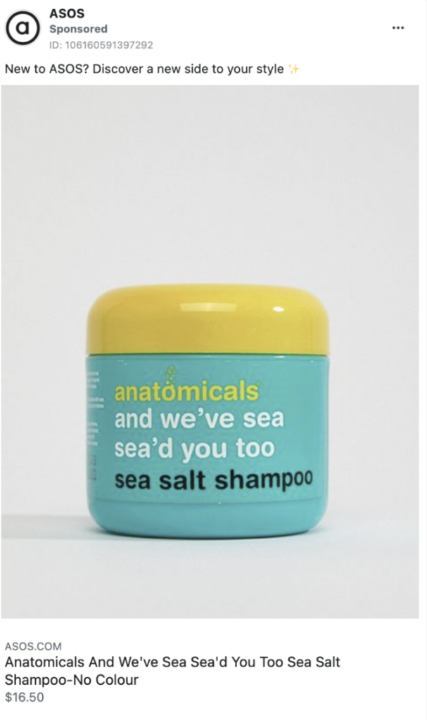
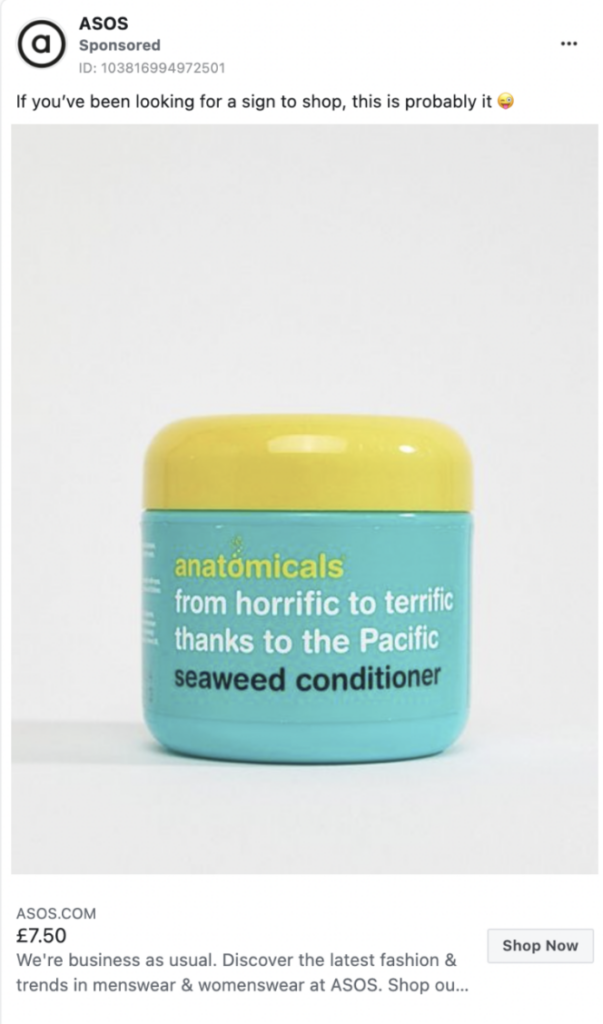
Notice how the headline commands action in both examples – “Add to your collection”, and “Pick your favorites”. The description, in this case, remained the same in both examples, but still was relevant to the headline, also commanding action (Shop now).
Include questions
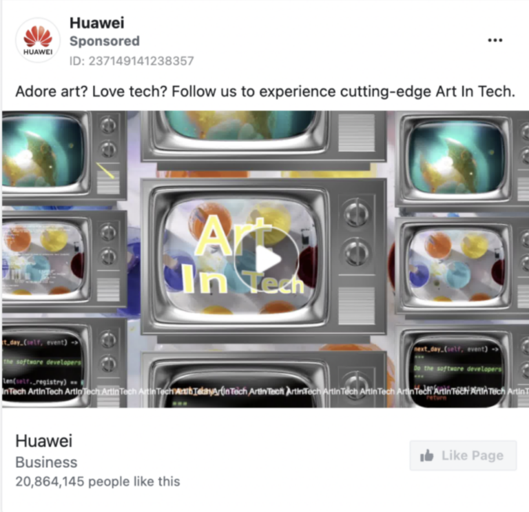
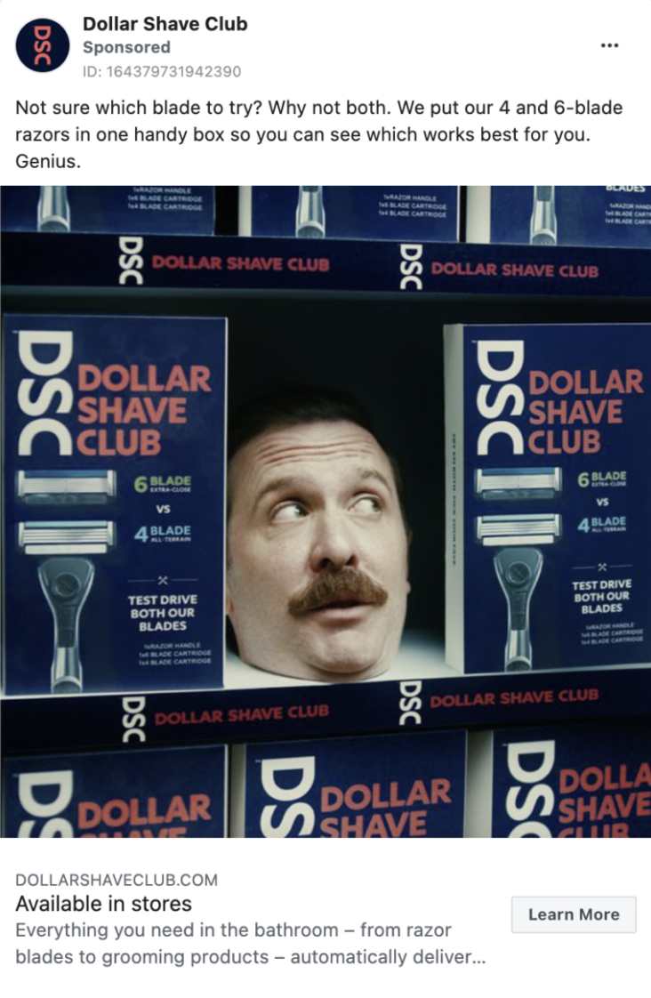
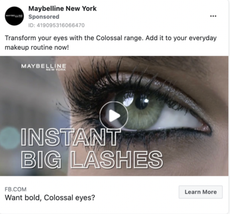
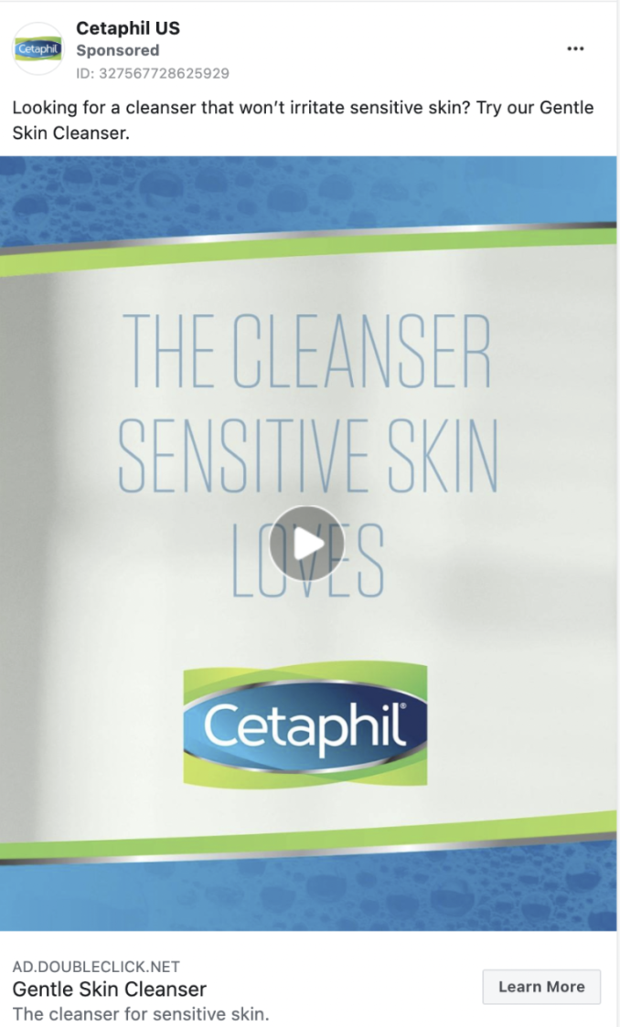
Adding a question in your headline or primary text is another great way to boost the Facebook ads’ CTR.
Research from Social Influence found that headlines in the form of questions received 150% more clicks than statement headlines. Including the word “you” in a questioning headline made it receive even 175% more clicks! Here are some examples to help you get an idea of it:
Use emojis
Emojis are another great way to boost your ad engagement.
Our A/B test showed that using the right emojis increases the conversion rate by 110%.
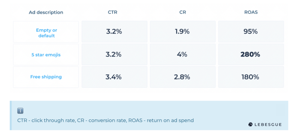
Before you start using emojis in your ads, think about your business, products, and messaging you’re trying to send. For some businesses, emojis aren’t a good fit, because they simply don’t resonate with their branding and tone.
We definitely recommend, at least, A/B test it so you can find out what works best for you. Oh, and if you’re not sure which emojis you should be using, here’s a list of 20 best-performing emojis for Facebook ads.
Use FOMO
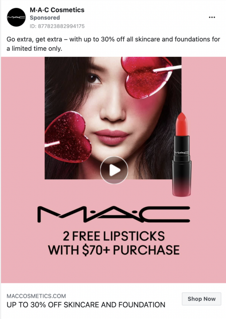
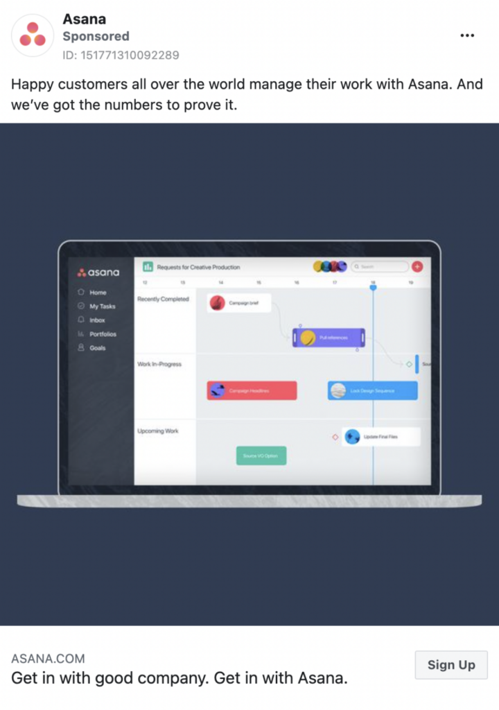
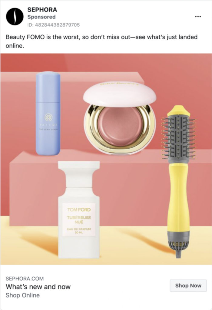
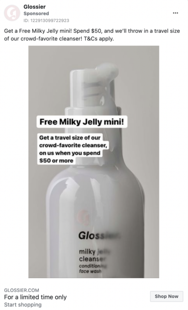
Using the FOMO (Fear Of Missing Out) strategy in your ad copy is a great way to not only boost Facebook ads’ CTR but also conversions. With this messaging, you’re essentially telling your audience to latch on to every opportunity before it slips through their fingers.
Imagine scrolling through Facebook and seeing this MAC Cosmetics ad (example below). Maybe you weren’t that keen on purchasing something, but just by seeing this ad, you’re at least pushed to think about it. The phrase “for a limited time only” is great because it increases your FOMO, creating a sense of urgency for purchasing.
Another FOMO example is this Asana ad copy that makes the reader think that everyone else is already using their software and the person reading is missing out.
You can incorporate the FOMO strategy in the headline of your ad as well, just like Glossier did in their ad.

Facebook ads placements
Some advertisers prefer to simply place their ads on Facebook and Instagram, excluding Messenger or Audience Network. But is that a best practice?
Results show that placing ads primarily on Facebook results in the highest click-through rate (3.90%), while the CTRs on Instagram, Audience Network, and Messenger fall under 1%.
NOTE: Detect all Facebook ad mistakes that hurt your CTR with Lebesgue Automated Audit.
Use social proof
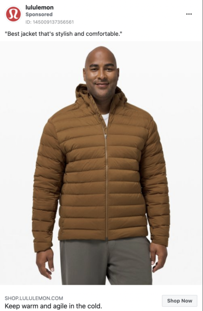
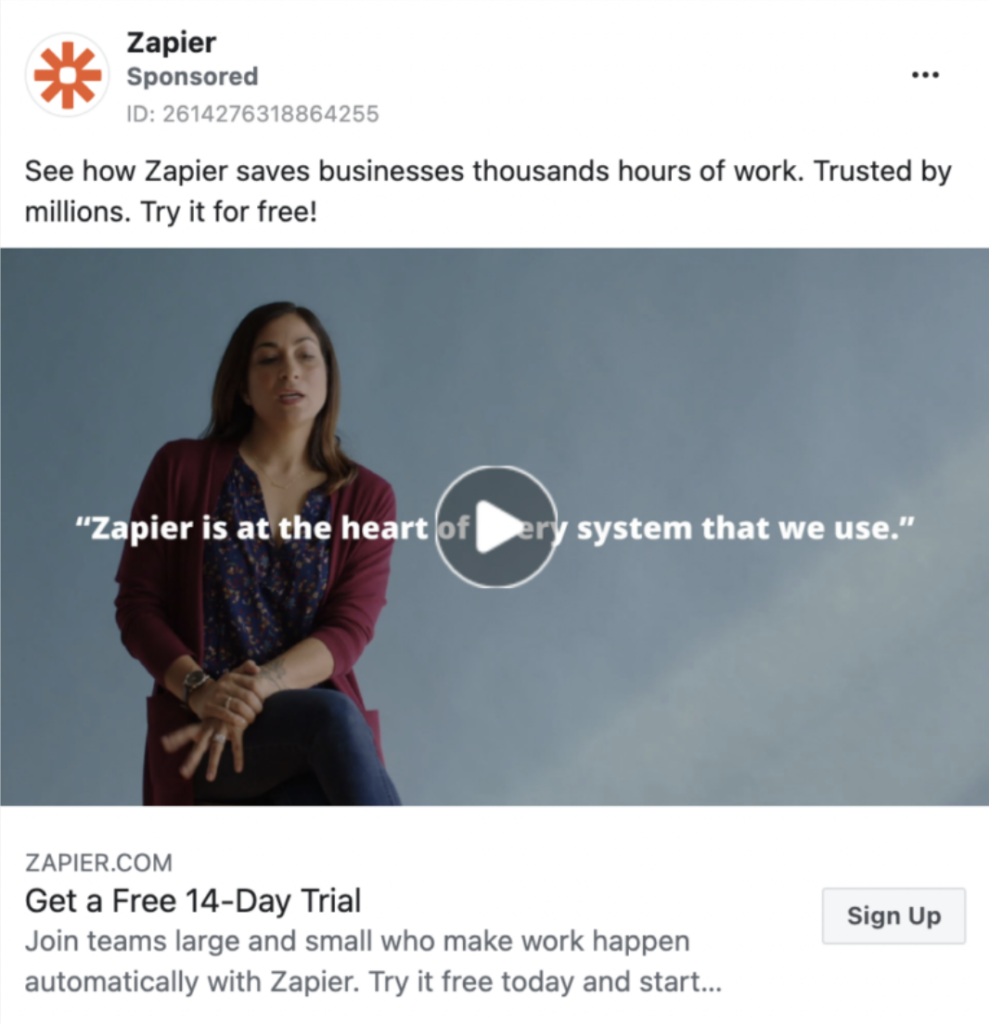
Another great tactic for boosting Facebook ads’ CTR is showing social proof. This is one of the best ways to reassure your target audience about your product.
So gather up your best user reviews or press coverages and feature them in your ad image or copy, to boost users’ engagement. Here are some examples that illustrate this trick:

Static vs. Animated Image
Wondering if static images perform better than animated ones?
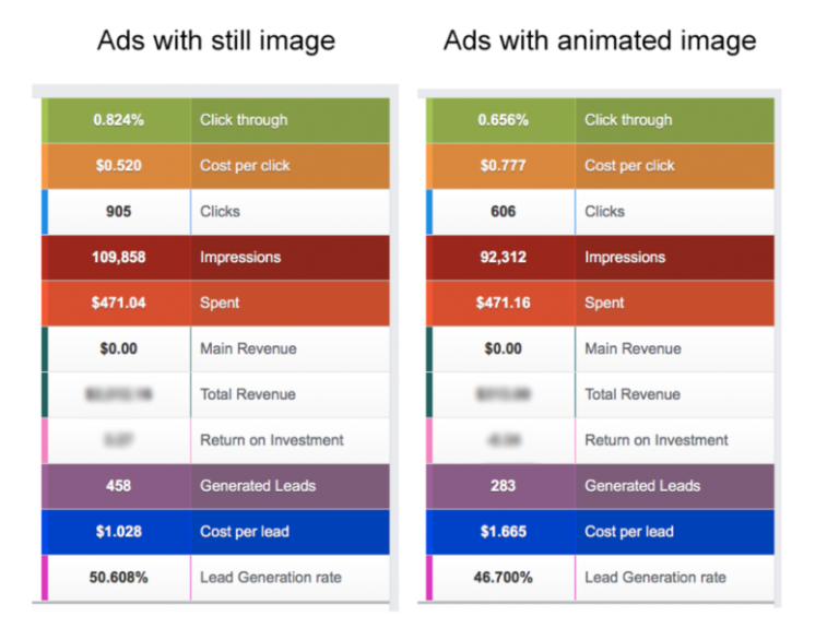
Ad Espresso did a test to find out which of these two performed better in terms of click-through rate and cost-per-click. Here’s the comparison of the campaigns’ results:
Note: The goal of this Facebook ad campaign was to generate leads.
In terms of Cost Per Lead (CPL), ads with static images outperformed animated images by 38%. And you can also see that ads with still images had an average CPC of $0.52, and again outperformed animated images by 50%. Also, the difference in the CTR was around 25%, so there’s no doubt that using a static image would probably be a better choice.
Square vs. Landscape
Another thing you might ask yourself is which ad format to use for your images or videos. Overall, the square format is larger, and good for mobile because it fills up most of the screen.
Square is the go-to format for most advertisers and is used both for ads and organic posts. The Landscape format is good because you get a bit more space for your ad copy, but still, is it worth it?
In another test, AdEspresso found that square images have a lower CPA than landscape images (35% difference). The largest difference was on Instagram, where using a landscape image made the CPA 2.5 times higher than for a square.
This makes sense, as most organic posts on Instagram are in a square format, so when seeing a landscape image, people probably assume it’s an ad and scroll past it.
The psychology behind successful Facebook ads
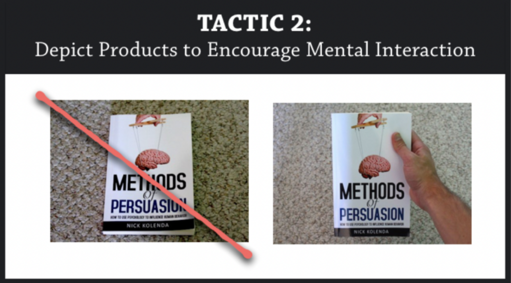
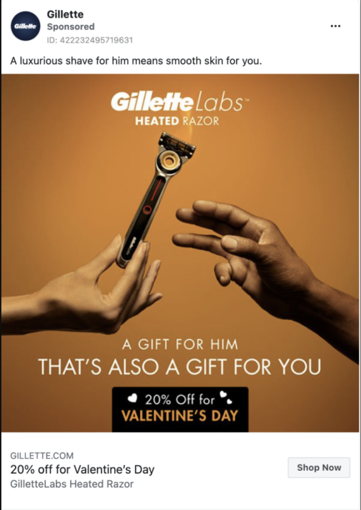
When thinking about the images and copy of your ads, there are a lot of psychological tricks to consider. Nick Kolenda researched this and came up with 27 different advertising tactics based on psychology. The trick that caught our attention, was the following one.
Depict Products to Encourage Mental Interaction
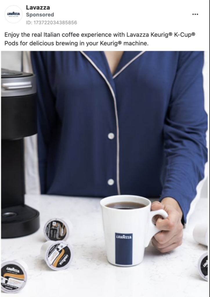
Elder & Krishna (2012) did an experiment where they showed participants an ad for a coffee mug. It turned out that the majority of the participants were most likely to purchase the coffee mug when the handle was facing right, toward the dominant hand of most people.
When you look at the images below, this makes a lot of sense. The researchers attributed that finding to heightened stimulation. So when the handle was facing right, participants mentally interacted with the product – imagining the action of taking the mug with their right (dominant) hand.
“…when participants have their dominant hand available, the corresponding visual product depiction leads to higher purchase intentions.”
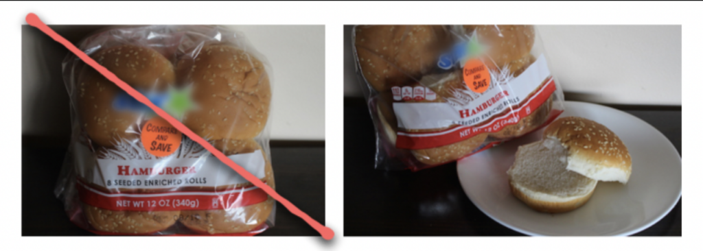
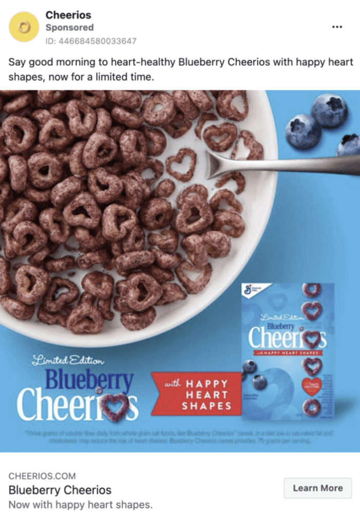
Here are some ad examples that showcase these tricks:
Summing Up
The last piece of advice we’d give you is to test, test, and test. If something isn’t working, try something else. If something is working, try something else to see if it works better.
You never know what’s going to resonate with your target audience, so you constantly need to work on your ad creatives and copy. Also, make sure to test some of these tips, we guarantee you’ll see a difference in your Facebook Ads CTR.

