
A low add-to-cart rate can really negatively affect your revenue. According to statistics, the average add-to-cart rate is just around 3%, while a typical add-to-cart conversion rate is around 7%. But even a minuscule increase of 1% can have a huge impact on your revenue and the total number of purchases.
The question though is how do you increase your add-to-cart rate?
To improve your add-to-cart rate you should:
- remove dynamic checkout buttons
- focus on one CTA
- add social proof
- check your page load time
- optimize for mobile
- mention free shipping
- create a sense of urgency
- make the cart icon visible on every page
- don’t redirect customers to the cart page
- make your website look more trustworthy.
While many e-commerce businesses employ abandonment cart emails effectively, data shows that only about half of these emails are opened, and even fewer result in clicks. Therefore, it’s essential to ensure your cart page is optimized to reduce instances of customers leaving products behind.
So, stick with us, and let’s break down those different tips that can help you improve your add-to-cart rate.
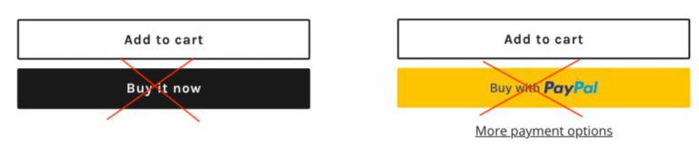
One thing we often see on a lot of product pages is two call-to-actions that are both purchased-oriented.
The “Add-to-cart” is the one that the majority of e-commerce stores tend to use, with a purpose to guide customers through the checkout process. The “Buy now” button is essentially the same thing, but with one step less, taking you directly to the checkout page.
But why we recommend sticking with the “add-to-cart” button?
We can all agree that the first action we want visitors to take when landing on our website is to add products to the cart.
But in order to do so, we want to have the simplest and most predictable checkout flow possible, highlighting one primary action.
Therefore, we found that having two similar call to actions only confuses users as they might not be sure which action to take.
Plus, the add-to-cart button is much more intuitive and it’s not that pushy as the “buy it now” button.
Focus on one call to action (CTA)
As with the product page, you want to apply a similar philosophy to your homepage.
Think of one primary action you want a visitor to take when they land on your website. Should they shop your products, book a call, start a free trial, or something else? Decide which one resonates with your business goals the most and make that your central call to action.
But hey, don’t get us wrong, having more than one call to action is totally ok. In fact, if we’re talking about your homepage, you’re definitely going to have more than one CTA.
The thing to make sure though is to organize them well, so that your website has a natural and intuitive flow.
Add social proof
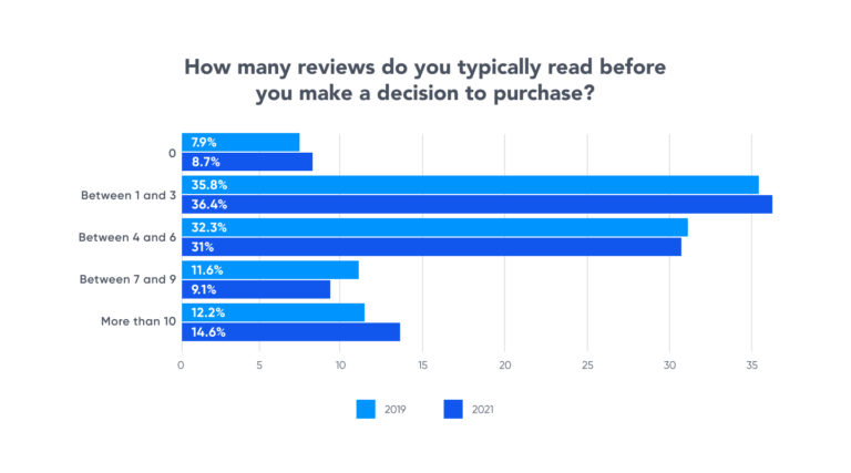
How many times do you purchase something without checking any reviews for it? Doesn’t happen that often, right?
That’s why testimonials and social proof should be a crucial part of your website. People are like to reassure themselves about the product they are about to buy, so make sure to add some type of social proof on your website. This can be customer testimonials, real-time stats, case studies, or something else – the choice is totally up to you.
On the following graph we can actually see the stats that confirm what we just explained. Reviews play a big part in users’ purchasing intent. The more of them you have – the easier is for the user to make a decision and purchase.
Check your page load time
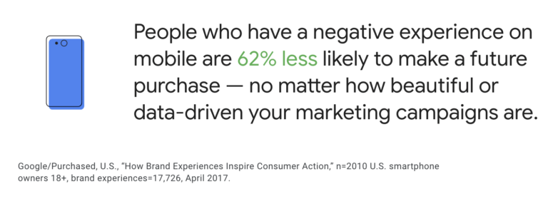
At first, you might not think about it, but site speed has a HUGE impact on your customers’ purchase behavior.
In fact, studies have shown that 47% of consumers expect websites to load in two seconds or less, while nearly 70% say a website’s loading time affects their willingness to buy.
Most businesses usually even don’t check their site speed and therefore they don’t know why users bounce off.
To check your site speed, open Google Analytics, and under the Behavior section click Site Speed – Overview section.
Optimize for mobile
According to Statista, mobile e-commerce sales reached $2.2 trillion in 2023 and now make up 60 percent of all e-commerce sales around the world.
So it’s safe to say that most of your customers will be accessing your website from a mobile device. Because of that, you have to make sure the mobile UX/UI design are user-friendly and on point.
Mention free shipping
The price of different products can really impact our purchasing decision. But for some people, shipping costs are equally important.
Nowadays most places offer free shipping for a minimum amount and if you’re not doing the same, you might be missing out on a lot of potential customers.
There are many free shipping options you can choose from, and once you start offering it, most people will be more willing to add items to their cart and make a purchase.
Regardless of the free shipping option you choose, don’t forget to mention it upfront. Meaning, not at the checkout, but in a place where customers will be able to notice it right away.
Create a sense of urgency
Creating a sense of urgency is another way of encouraging customers to take action and add an item to the cart. There are different ways to incorporate urgency on your website such as adding a countdown timer that allows visitors to view the exact amount of time they have left to rethink your offer.
Limited time offers also work great as they drive urgency and trigger users to not miss out on the special offer.

Make the cart icon visible on every page
Another important UX factor to consider when you want to improve your add to cart rate is making sure the cart icon remains visible on every single page.
Similarly, if someone adds a product to the cart, make sure the cart icon is updated with the number of added items.
Don’t redirect customers to the cart page
When a user adds something to the cart, make sure to allow them to stay on the product page instead of redirecting them to the cart page. Sending users to the cart page every time they add something to the cart means they have to go back in order to continue shopping.
Most of the time this creates a bad user experience, especially if users are shopping from a mobile device.
Make your website look more trustworthy
Designing a clean and professional-looking website is also the key to improving your add-to-cart rate.
If your website appears disreputable, visitors will most likely take their business elsewhere rather than taking the risk of a possible security issue or receiving questionable service.
It’s all about creating a simple, yet great user experience that will educate visitors on your core values, products, benefits, etc.
Your turn
Now that you know what are our top tips for improving your add-to-cart rate it’s time to put them to practice. Let us know in the comments if you’ve already implemented some of these tips or if you have any other recommendations to share.
For more blog posts like this, check out our blog and subscribe to our newsletter.
⭐⭐⭐⭐⭐
100+ five-star reviews on Shopify App Store
to get free advertising optimization tips and exclusive insights


No comment yet, add your voice below!