Creating an effective homepage CTA (Call to Action) is crucial for driving engagement and conversions.
So, in this blog post, we’ll explore key strategies to optimize your CTAs, ensuring they are clear, visible, and relevant to your audience.
Let’s start!
First, let’s start by explaining what CTA is.
So, “CTA” stands for “Call to Action.” In the context of an e-commerce homepage, a CTA button is a clickable element designed to prompt visitors to take a specific action, such as making a purchase, signing up for a newsletter, or exploring a product category.
These buttons are strategically placed and often use compelling language or visuals to encourage user interaction.
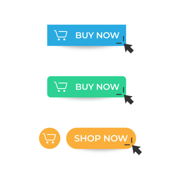
For example, a CTA button might say “Shop Now,” “Sign Up,” “Learn More,” or “Add to Cart.” The goal is to guide visitors toward engaging with your website and ultimately completing a desired action.

Optimizing your Call-To-Action
When placing a CTA on your e-commerce homepage, consider the following factors to optimize its effectiveness: clarity, visibility, placement, relevance, and mobile optimization.
Clarity
The text on the CTA button should clearly state what action the visitor will take when they click it.
For example, if the purpose is to encourage visitors to make a purchase, the CTA should say “Buy Now” or “Shop Now.”
Also, avoid using vague or ambiguous language that could confuse visitors. Instead, use direct and specific wording that leaves no room for interpretation.
Besides the text, the design of the CTA button should also contribute to its clarity. Use contrasting colors, appropriate font sizes, and whitespace to make the CTA stand out and easy to read.
Overall, the goal of clarity in a CTA is to make it as easy as possible for visitors to understand what action they’re being asked to take and to encourage them to do so with minimal confusion. This clarity ultimately leads to higher engagement and conversion rates on your website.
Visibility
When it comes to visibility in a CTA (Call to Action), the goal is to ensure that the button or element is easily noticeable and draws the visitor’s attention.
Choose colors for your CTA button that stand out against the background of your webpage. This contrast helps the button pop and grab the visitor’s attention. For example, if your webpage has a light background, use a vibrant color for the CTA button.
Also, you could use a font size for the text on the CTA button that is larger than the surrounding text on the webpage. This emphasizes the importance of the CTA and makes it easier to read.
Larger fonts also help users with smaller screens or those viewing your site from a distance.

Placement
Placement of the CTA (Call to Action) is crucial for maximizing its effectiveness.
Position the CTA in a prominent location on your homepage where it immediately catches the visitor’s attention. Avoid burying it within other content or placing it where it might be easily overlooked.
Also, aim to place the CTA above the fold, meaning it should be visible without requiring the visitor to scroll down the page. This ensures that it’s one of the first elements visitors encounter when they land on your homepage, increasing the chances of engagement.
Mobile optimization
Mobile optimization of the Call to Action involves ensuring that the CTA button is easily accessible and visible on mobile devices, given that a significant portion of e-commerce traffic comes from mobile users.
Implement a responsive design for your website that adjusts the layout and elements based on the screen size of the device being used. This ensures that your CTA is appropriately scaled and positioned for optimal viewing and interaction on mobile devices.
Make sure that the CTA button is large enough to be easily tapped with a finger on a touchscreen device. The recommended minimum size for touch targets is around 44×44 pixels to accommodate the average finger size and minimize the risk of accidental taps.
Best Practices for CTA on Homepage
The first step in optimizing your CTA on the homepage is to ensure that it’s actually working.
This means checking that the link associated with your CTA button leads to the intended destination and doesn’t result in a 404 error.
A lot of businesses overlook this simple step, but it’s crucial because a malfunctioning CTA can lead to lost opportunities and potential customers.
Understanding the ideal customer journey is essential for guiding your website visitors toward a conversion. In the case of an e-commerce business, the ideal journey typically involves progressing from the homepage to product collections and finally to the checkout page.
Therefore, it’s vital to ensure that your homepage CTA effectively leads visitors to the collections page, where they can explore your products further.
Homepage CTA a/b test
The text used in your CTA plays a significant role in its effectiveness.
In this example, the recommended text for the CTA is “Shop Now,” which directly communicates the action visitors are encouraged to take.
However, we did an a/b test regarding what should be on your CTA.
The A/B testing compares different versions of a CTA to determine which one performs best in terms of conversion rate (CR).
In this case, the A/B testing results showed that the “Shop Now” CTA achieved the highest conversion rate of 1.5%, compared to alternative texts like “Learn More,” “Order Now,” and “Try Now.”
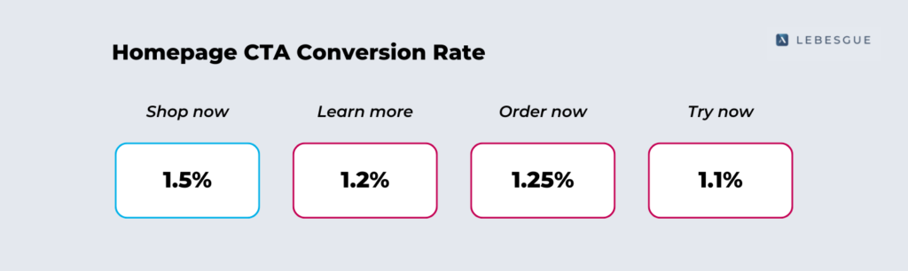
Based on the A/B test results, our recommendation is to use the “Shop Now” button to increase sales.
This conclusion is drawn from the statistically significant higher conversion rate observed with this specific CTA text.
By following these best practices, businesses can ensure that their CTAs are not only functional but also optimized to guide visitors through the desired customer journey and ultimately increase sales and conversions.
Summing up
Optimizing CTAs on an e-commerce homepage involves making them clear, visible, and relevant. Ensure that the CTA stands out visually, is prominently placed, and leads visitors on the desired customer journey. Don’t forget to optimize for mobile users and test different CTAs for effectiveness.
By following these steps, you could increase engagement and drive more conversions on your websites.
⭐⭐⭐⭐⭐
100+ five-star reviews on Shopify App Store
to get free advertising optimization tips and exclusive insights


No comment yet, add your voice below!