
In order to better understand the behavior of the essential metrics in online marketing performance, it is useful to see whether there is a continuous growth or decline of an observed variable over time.
In other words, it would be useful to be able to detect trends. It can help us to show certain business problems or find out that our marketing campaign may not be working as we would have expected it to.
For example, if we start running a new ad and after the CR (Conversion rate) has a downward trend, we can conclude that maybe the new ad is not performing well. Additionally, if we are comparing the values of a variable on a weekly basis (this week vs last week), any change may be insignificant by itself. But with such an analysis, we may miss a certain long-term trend.
In general about correlation
In our previous blog post, we explained the theory of correlation coefficients in detail. We have shown how different coefficients check the relationship between variables. For those who are not mathematicians, interpretations and examples in that blog post offer a fairly good understanding of the theory.
What variables do we analyze?
We analyze the variables that we believe will be useful to you:
- CAC (Customer acquisition cost)
- CR (Conversion rate)
- CTR (Click-through rate)
- CPM (Cost per mille)
- CPC (Cost per click)
- ROAS (Return on spend)
If you do not understand any of these metrics or want to know more, take a look at the following link.
How do we detect a trend?
We observe a certain variable of interest over a certain time period. Therefore, if we find a significant correlation coefficient between an observed variable and time period, we can use it to detect a trend.
Take, for example, the daily CAC value. Let’s denote the time with x and CAC values with y. First, we use correlation coefficients to find the strength of the correlation between x and y.
If it is significant we can use its sign to determine the growth or decline of CAC values over time. For example, if there is significant linear growth over time, the Pearson correlation coefficient will be extremely high and positive, suggesting a strong linear relationship.
By testing the hypothesis about the significance of the correlation coefficient, we confirm or refute the significance of the relationship i.e. the existence of a trend.
Additionally, if there is a monotonous relationship, the question arises: Is the trend significant? For example, if the CAC values increase linearly over time, it is important what the direction of the coefficient is.
For this purpose, it is necessary to test the hypothesis about the significance of the linear model. You can read more about measuring brand awareness on our post.
In the case of non-linear trends, we use other models to look at the rate of increase or decrease in value.
Understanding through examples
Example 1
Let’s show this right away by an example. Let’s mark with x = TIME and y = CR. In the graph below we show the daily data example.
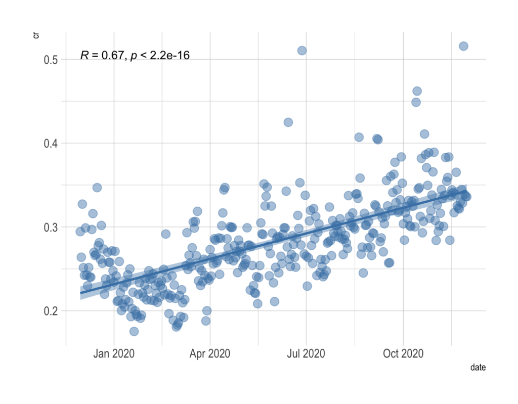
If there is a reliable and large correlation coefficient between x and y it is very likely that there is some trend. From what we see on the plot, it is obvious that there is a trend. We confirm that with the values of correlation coefficients between x and y:
Pearson’s | Spearman’s | Kendall’s |
0.67 | 0.71 | 0.51 |
Pearson’s coefficient tells us how strong the linear connection between the data points is, while Spearman’s gives us the strength of the monotonic connection. We interpret the Kendall coefficient as follows: there is a positive correlation between 75.6 %of all possible pairs of data points (explained here).
Therefore, we conclude that there is a positive monotonic relationship. The next step is for us to discover what the growth is like. Is it a significant trend? How fast does CR grow?
The graph also shows the results of the linear regression model. We see a fit regression line along with 95% reliable intervals. The model equation is given by
From this, we can, for example, conclude that for a time shift of 10 days, CR increased by 0.3343%. Our linear model explains the 45.1% variation in the data. The model is significant, i.e. there is a significant linear increase in CR values over time. This is probably not the best model for predicting a variable, but it gives us good information about the trend.
Example 2
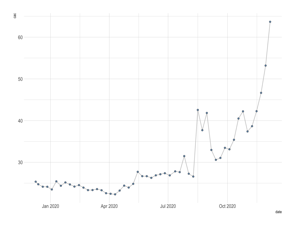
In this example, we analyze data on a daily, weekly, and monthly basis over a period of one year. We want to illustrate how our algorithm works. It is important to note that the algorithm for daily and weekly data detects a trend in the recent past, while for monthly data it looks at the overall trend.
So, for daily data, we look at the last 25 days and find out if there is a trend during that period. The following is a graphical representation and results for the daily data.
In this case, the algorithm observes whether there is a trend in the recent past. The following result was obtained:
- There is a growing trend in the last 25 days!
- The algorithm recognized significant linear growth, graphically shown in the following figure.
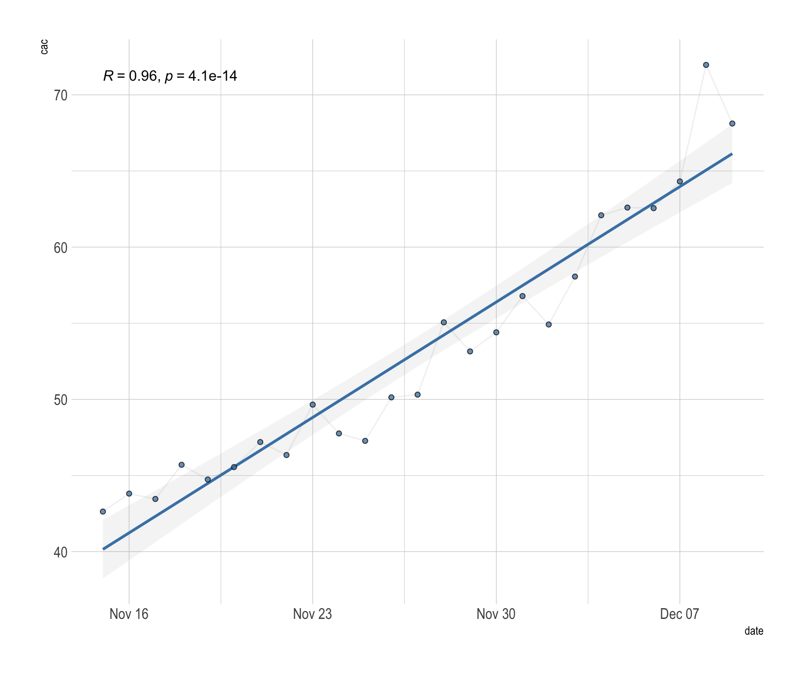
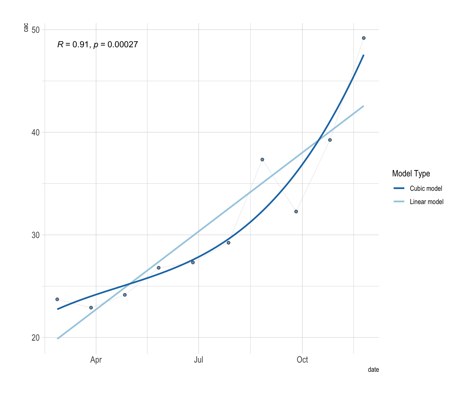
Let us now look at the weekly data we have shown below. As we have already said, for weekly data we also analyze the recent past (last 12 weeks).
Our algorithm gives the following results:
- There is a growing trend in the last 12 weeks!
- The algorithm recognized significant growth, graphically shown in the following figure.
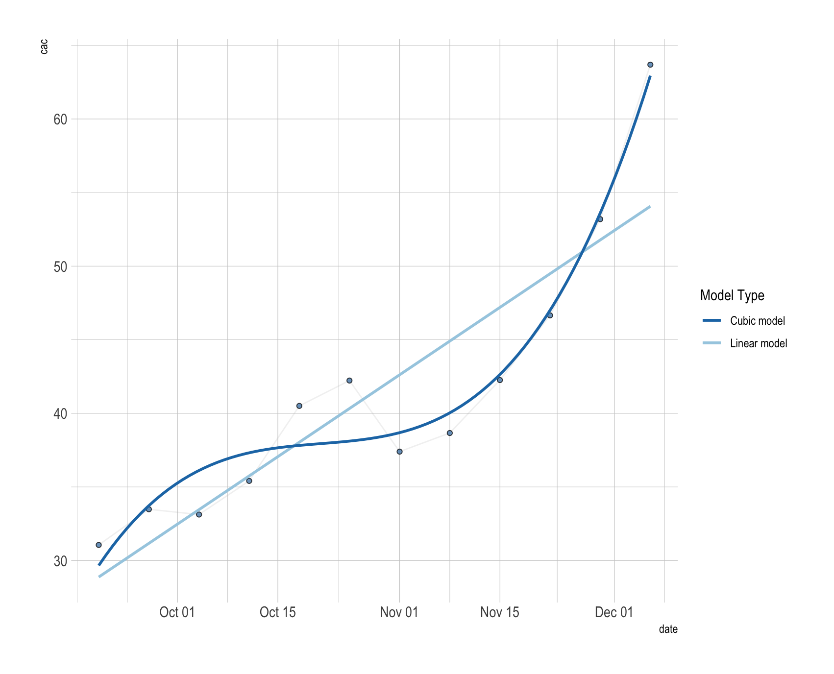
The results of two models are presented: a linear and a cubic model. The cubic model finds a fit curve of the third degree, which in this case better describes the movement of the data.
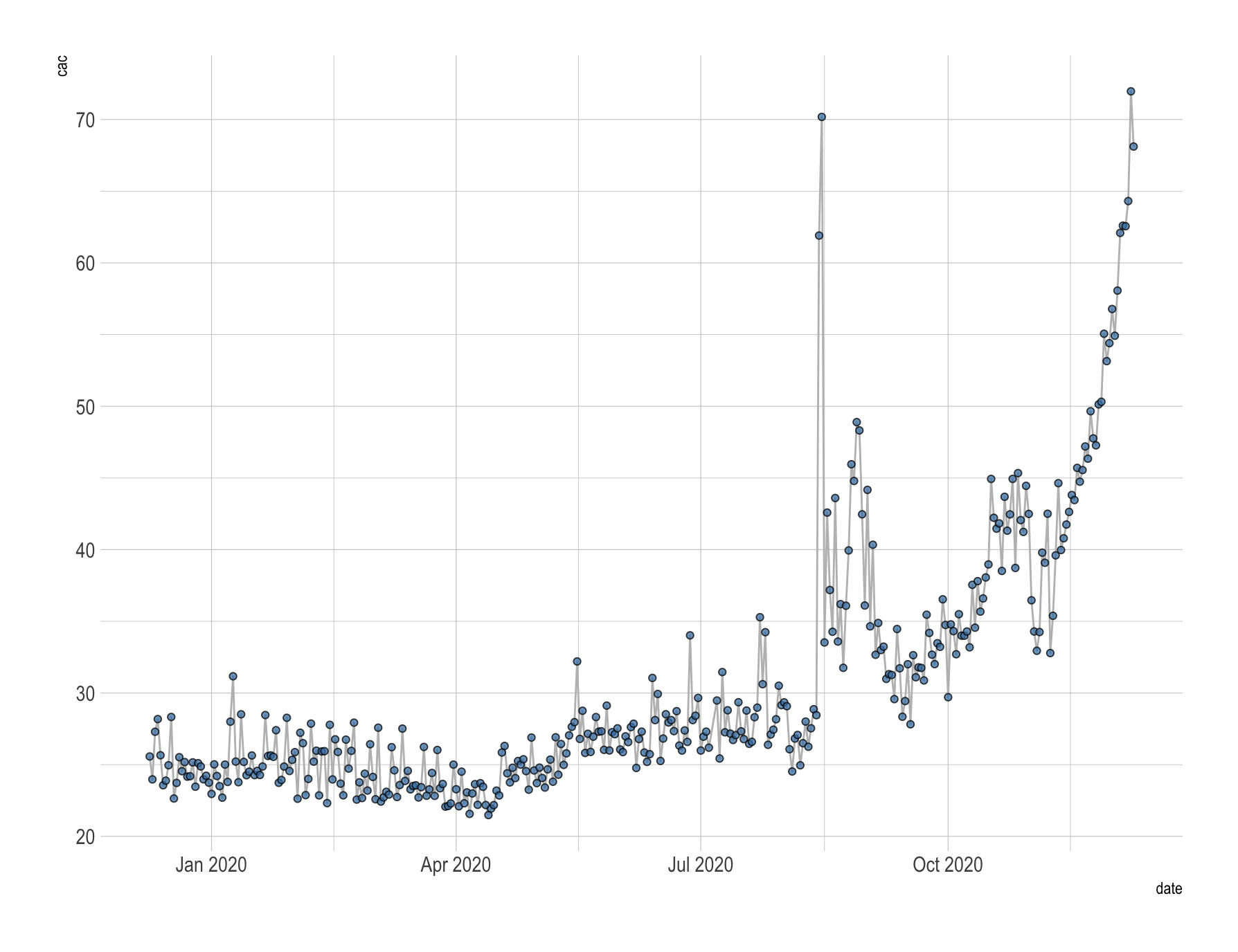
Finally, we look at the overall trend on a monthly basis.
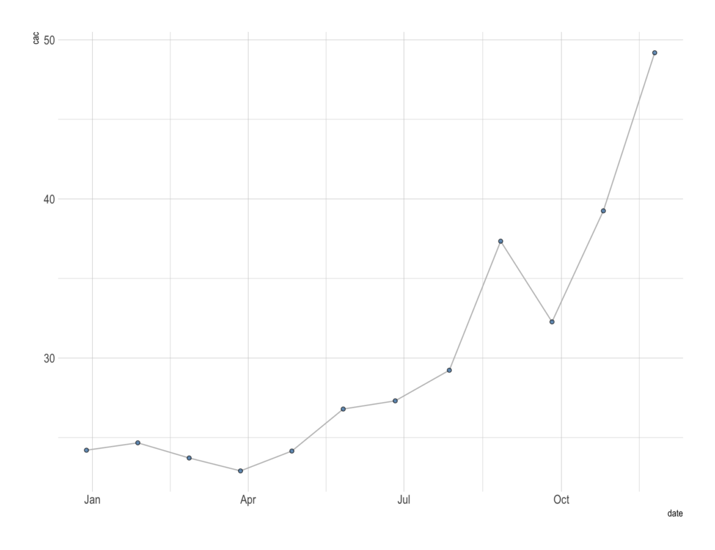
From the graph we can already conclude that there is a continuous growth of CAC values. The result of the algorithm confirms our guesses:
- There is a growing trend in the last 10 months!
- As we expected (according to daily and weekly data), growth was recognized. We have shown the fit curves of two different models in the following graph.
You’re probably wondering why we’re only looking at the recent past for daily and weekly data. Consider the following: CAC values have a growing monthly trend over the last 10 months. So you make some changes after which you expect the CAC values to stop rising.
Here is where daily and weekly trend detection shows its value. The monthly trend will not suddenly start to change, but the daily and weekly ones will.
If the CAC values start to fall, it will first be seen on a daily basis, so in a week, the algorithm will tell you: There is a falling trend in the last 7 days! That way you will know that the change you have made has a good effect on your business.
Our main goal is to notify you!
From the examples, we can conclude that trend detection analysis can give information on the long-term and short-term behavior of certain metrics that are important in online marketing. For each of them, we want the best performance for better business performance.
So, we can check the strength of the relationship between time and certain metrics of interest. As a result, we can
- analyze trends for different variables of interest for daily, weekly, or monthly data,
- detect when trend exists,
- and tell if there is a significant increase or decrease in variables.
There is more!
The step after this analysis is to compare the trends of different variables. We want to find the greatest influences among the variables of interest. In more detail, we want to answer the question: why does a variable rise or fall. If you found this feature useful, let us know, we’d love to hear your thoughts!
Our app is coming out soon
Using the methods that were explained in this blog post, we’re working on developing a new app that you will be able to use to gauge your marketing performance and have a timely reaction to the trends that are detected in your performance. So, if there is a trend for any of the variables, we will send additional messages:
- Whether data is rising or falling.
- How long has there been a trend?
- Sentiment: Is that good or bad?
Trend analysis is just one of the many features that will be included in our Advertising Insights app. Apart from alerting you to trends that were detected in your marketing performance, the app will give you many other actionable insights on how to improve your performance.
If you’re interested in seeing how it works and want to use it on your data and improve your marketing performance, sign up to be the first to know when it’s ready for action! (Hint: It’s coming out really soon now so hurry up and sign up!)


No comment yet, add your voice below!